On Oct 11, 2014, at 7:37 AM, Artivideo email@hidden wrote:
Hi Walt,
First of all the reason I and most people buy Freeway is that you don’t have to know anything about programming code. It is an object orientated program to design a website. As far as I know Cascading Style Sheets (CSS) are only available in Freeway for text items. If I am wrong point me to CSS for graphic items like backgrounds and other presentation items which are visible on every page at the same position.
Owning power tools does not make you a better craftsman, however, understanding wood grain will give you consistently smoother finishes, whether you use a block plane or a planer. Learn your materials, you will get better results and be much happier with your work product in the end.
I decide on making the size 1920*1080 px and only made the grey gradient middle part 2560 width since for some reason it does not scale to higher widths when I design it to 1920 like the background blueish picture.
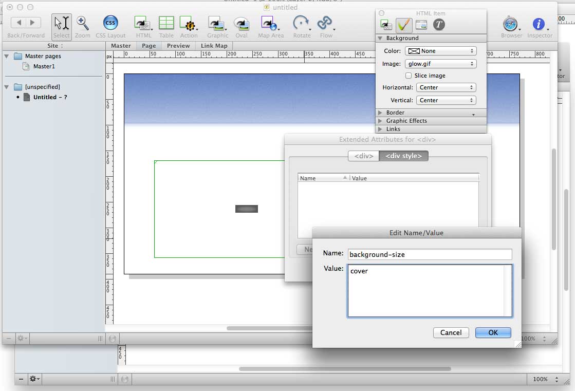
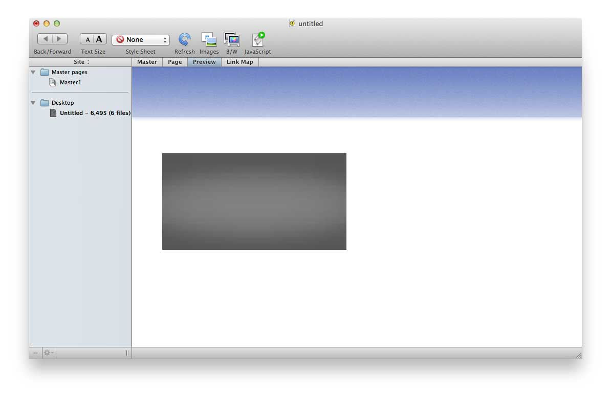
A background image can be forced to any size you like, and it doesn’t need to start out at that size. Look at this (forced and extreme) example. Here’s how it looks in Freeway:
And when you preview:
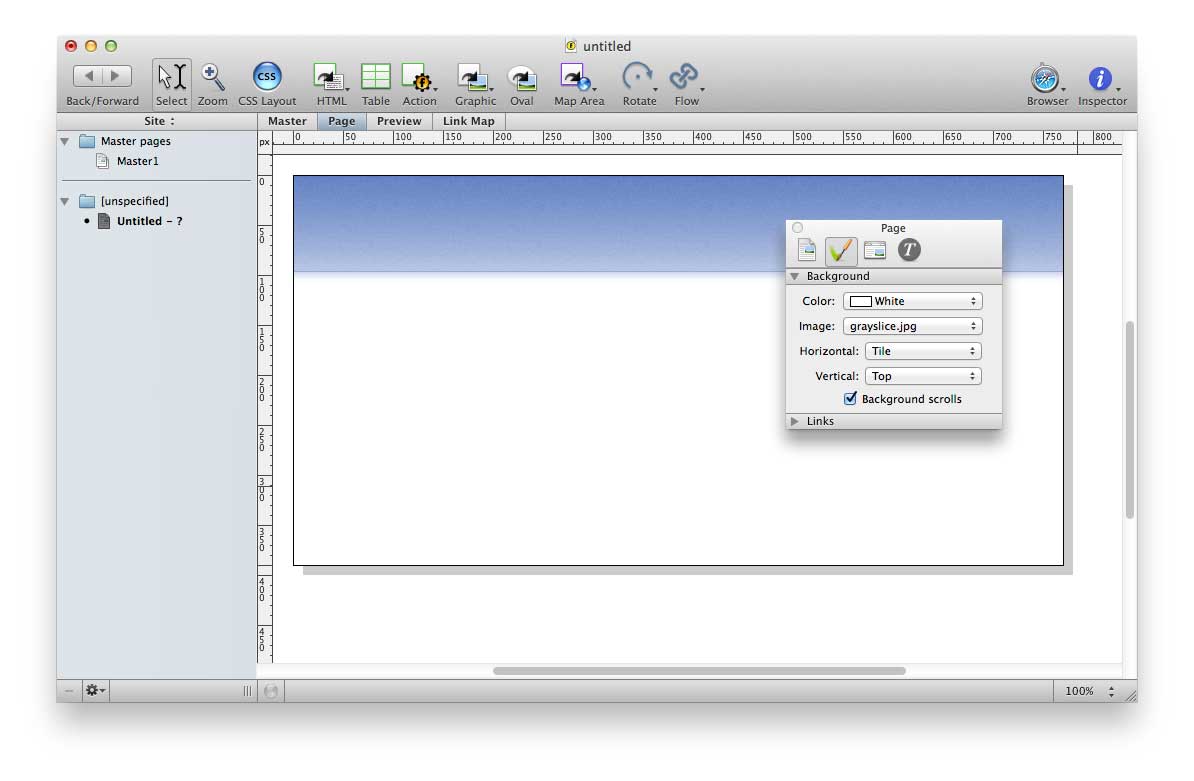
That example is using the image from FreewayTalk as linked earlier in this thread. Of course, that presupposes that you are creating true background images, and are not simply drawing a graphics box and sending it to back. I suspect you may be confusing the latter with the former, and they are seriously not the same thing. When you create a true background image, it will not affect the outside dimensions of your page in any manner. You will never need to set its left and right to negative dimensions. It will always fit the screen. If you have drawn elements on the page to act as your background, select each of them and delete them right now. Then use the same images as either page or HTML item background images, using the Inspector. By setting an HTML item (which can be flexible in dimension) with a tiling or scaling background image, you can achieve your ultimate goal of a page that fills your screen without producing scroll bars on smaller screens (which you will find represents the vast majority of all visitors to your site).
The Freeway interface will be entirely WYSIWYG, except for any elements you have used the Extended attributes on, and even then, a quick tap into the Preview mode will show you your evolving design. Freeway’s CSS styling tools (which do extend to HTML items — background color and image, and margin and padding, etc. are CSS attributes) represent a cut-down subset of the entire world of CSS, and most things you will find on line in tutorials and design articles can be made to work in Freeway using the Styles palette and the various Extended dialogs. You will find that many things are labeled in old-school DTP terms, where there are well-defined and different terms for them from CSS. You may need to consult the list to discover that line-height (from the tutorial you are reading on Smashing) is the same thing as Leading in Freeway.
Getting to know your materials will be a great step forward for your work and your practice as a craftsman. Design, after all, is not how it looks, but how it works.
Walter
On 10 Oct 2014, 2:49 pm, waltd wrote:
As far as your layout goes, this layout can be done with CSS very simply, and Freeway will do most of the work for you.
But in your head, you have fixated on physical dimensions – and the Web does not work that way.
Your display is freakishly large, and you are viewing the page full-screen. You cannot assume the same will be true at all for anyone else. I have a 17" PowerBook with the high-ppi screen, it is “wider” than my 20" Cinema display (I use two of those side-by-side on my Mac Pro). In both cases, I rarely have my browser window wider than 1200px, even though I will often stretch the window out really wide to see how badly something breaks.
When designing a page, you need to decide on a largest width you will support, and then provide a graceful degradation from that point in both directions (smaller and larger). You need to create a flexible layout that uses the very smallest-dimension resources you can make, because that will make your page load faster. If you look at the FreewayTalk site, you will see an example of that – a page that centers on the widest screen you can place it on, and has a graphical header and footer that can grow to fit without any ridiculous-sized resources. The header is two images:
The footer is a solid color in CSS. By controlling the repeat of these two images, they overlap and you never see the seam.
Your page could be broken down in a similar manner, and would require far fewer resources and would adjust to suit any screen without further effort on your part. Because your background is not nearly as tile-friendly as mine, you would need to make larger slices, but you still would be able to repeat the image if you look at it carefully enough. But you still could manage the effect by carefully planning the pieces.
Walter
freewaytalk mailing list
email@hidden
Update your subscriptions at:
http://freewaytalk.net/person/options


freewaytalk mailing list
email@hidden
Update your subscriptions at:
http://freewaytalk.net/person/options