Paul,
Pixels … it’s all about pixels (square dots). A computer monitor has a specific number of pixels (physically) and even although you can ‘fudge’ the monitor resolution in System Preferences … this doesn’t actually change the number of pixels your monitor has.
The only thing that matters for viewing an image on a computer monitor, is the pixel dimensions. DPI is irrelevant, as are any dimensions in inches or centimetres. Only pixels count.
So what you want to aim for with the images on your website, is the optimal image size … in pixels … to suit the largest number of visitors.
When you view a Responsive site, the computer that is being used to view the site, is resizing the images, ‘on the fly’ in order to fit them into the available space, so you want to aim for the largest monitor dimensions you decide is reasonable, because quality will be much better when an image is resized smaller, than when it is resized larger. This is because making an image smaller means throwing away available pixels, whilst making it larger means ‘inventing’ pixels, that do not actually exist in the image.
On your site, I noticed that the image dimensions in pixels was unnecessarily large for the 3 or 4 images I looked at. For example, 003NNaveandWTowers.jpg has pixel dimensions of 6157 × 5021. This makes it a 31 megapixel image (multiply the width x height = 31 million pixels … or 31megapixels). So this is important … the image is not 30Mb, it is 30megapixels. The byte size can vary widely, dependant on the format used for an image of fixed pixel dimensions. For example, a jpeg is much smaller in bytes, than a Tiff. But a Tiff is of maximum quality, whereas a jpeg ‘throws away’ quality to achieve a smaller byte size.
Your website, viewed on my 2560x1440 monitor, looks like this:
I’d estimate that your page width in FW, or the box containing the images, is ~800 pixels wide. So even on a much wider monitor, the images remain at around 800 pixels wide. So your 6157 wide image, is being down-sampled by a viewer’s computer. So you are actually only using about 13% of the image’s available pixel dimensions. If you resize it down to 800 pixels, it goes from 1.1Mb down to 220K. Just 20% of the size (in bytes). This means much faster loading and thus a much faster website.
So you can make your site faster, by optimizing your images to their ideal dimensions. Personally, I generally make my images either 2000 or 2500 pixels wide, depending on the site … but images are my business, so I want them to be large to show them in their best light. For you to do something similar and for them to actually be viewable at these dimensions, you’d need to change your page width in FW, to allow them to be displayed accordingly. However … you may find 2500px to be unusably large, or unweildy, with the images always being full-browser-width. So you’d need to experiment a bit and see what suits you best. If you turn on the Developer Menu in Safari (via Safari’s Preferences / Advanced Tab) you can use the Responsive Design Mode, to get an idea of how your site will be viewed on various monitors/screens and you can reach a pretty good decision in this way.
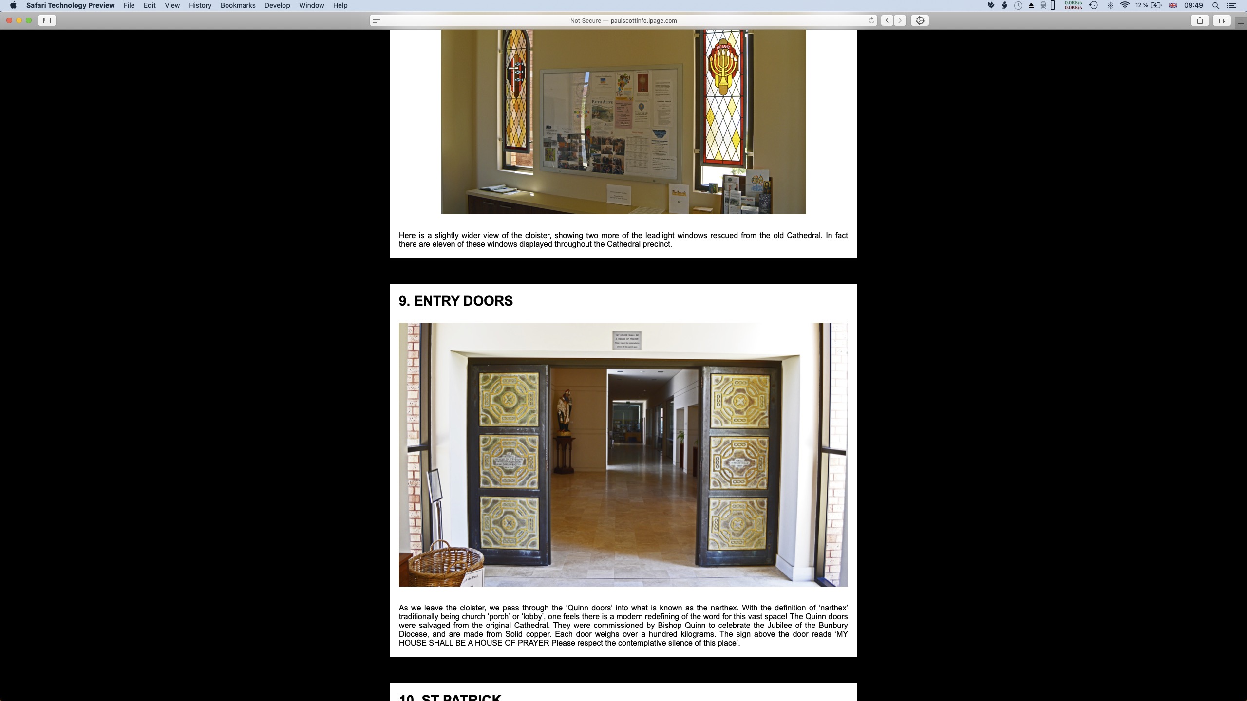
Regarding the blue skies. It seems that you’ve used a sky, which is already a jpeg, of probably smaller pixel dimensions that the main image and which, when you save your composite as a new jpeg, is once again compressed (pixels thrown away) and you end up with a Georges Seurat pointillism sky. Perhaps it doesn’t matter to you … I’m just pointing it out. This is how it looks at 100% on my Mac.
(NB!! Anything that isn’t at 100% is either being down-sampled … or … up-sampled ‘on the fly’ by your computer. 100% means that each and every pixel in the image, is being viewed as a single pixel on the monitor. So the image is displayed exactly as it exists, with no ‘on the fly’ fudging of any sort.)

For my own galleries, I use Juicebox Pro for some and Exhibeo Thumblie for others. Thumblie would work okay for your site I think. The crux to making the site being manageable (your original quesiton) is having the images as ‘passthroughs’ which means that FW will not resize them in any way … they will be exactly as you have saved them, with all exif intact etc. and they will not be a part of your FW document. FW will upload them to the Resources folder (which is a bit of an ugly way of handing them … but hey ho … perhaps FW8 will do something more elegant with them). The result of this approach, is that your FW file size remains small and manageable.
Ooof! 
freewaytalk mailing list
email@hidden
Update your subscriptions at: