I am very close to finishing my mobile site setup… What a process! Learned a lot along the way which I enjoy, many thanks to people on this forum like DeltaDave.
I am addressing my last issue where my menu once opened is fixed and the page behind it is scrolling if you are moving your fingers around the screen. I’d like that to be fixed while the menu is opened. Any pointers? I tried “Fixed in Window”, but that didn’t help. I would really expect the menu to be moving along with the page, or, the page behind it not to be scrollable while open.
This is driving me slightly insane, always appreciate the help.
The mobile menu has an option to appear with an overlay - set that to the colour of your menu background and you wont see the page behind.
David
Ah okay, thanks Dave! Will try that tonight.
Also, ty again for the tip on the hamburger. I will downsize that file. That is huge for a little guy like that, you’re right. Really appreciate your help.
Do you have a mobile device to see the menu issue that’s driving me crazy? In portrait I was able to achieve what I am looking for on mobiles… Created the breakpoint down at the lowest point, iPhone 4, and then made another breakpoint down at the iPhone 4 landscape… 320 and 480 width respectively.
If you view - www.yuskophotography.com on a mobile in landscape it looks weird and doesn’t act right. I’m trying to figure out within freeway but need direction.
Dave - I did make the background of the overlay black which when viewing in portrait fixed that issue for me and I’m happy with that. I am just confused why the font gets much bigger when in landscape and I can’t see the whole menu. I imagine that’s due to the size of the menu and the phone when In landscape is much shorter top to bottom.
Dave - What kind of mobile device do you have? Can you try going into landscape and see what I mean by the menu being funky? I tried fixing it on the main page, (www.yuskophotography.com) and it appears better but still… I can’t see the whole menu which I understand is because of the size but I don’t know what else to try. Diff style menu? Any suggestions?
BTW - resized my hamburger… Now it’s bite size. 10 to be exact :-p
I do not… I can take a screenshot, but, nothing is fixed. I have “stretchy” for width and height, I have the dimensions small enough… etc… I am at a loss! Driving me up the wall!
Later I will screenshot my settings and post, probably easiest. I hope you just say - oh - it’s THAT.
Great catch. Where is that string? I would have to view the code of the entire page correct? The only thing I’ve added but have since removed (so I thought) was Google analytics (I don’t even care for it), and this Fotomoto JS which allows people to buy my pics! - but it’s a waste of $.
If you can tell me where I can find that string, or I can look it up, I will delete that * and see whats up.
Oh okay, will take a look when I get in front of the app later.
The .m is a separate page. That’s how I understood it to work. I thought the mobile re-direct was supposed to function by having a different page set up and then you select it in the dropdown for that given page what will be the mobile site that when accessed on mobile it directs you to. So the way I have it set up is I have my normal desktop pages, and then under it I named them all m.YuskoPhotography, m.Travel, etc…
I’m sure you’ll reply saying since that’s the case to go ahead and look to remove that * and see the result since it’s not the same as the desktop page?
I thought the mobile re-direct was supposed to function by having a different page set up and then you select it in the dropdown for that given page
Generally the way it works is that a redirect to an m. site is to a completely different site running on an m. subdomain - not simply a page with m. in front of it.
The fact that you have file names including periods in them is enough to upset some browsers.
I see. Thanks for all your help. Let me try to address the * tonight and see if that does anything. If not, I will try removing “m.”… Hopefully one of those helps!
Dave - I ended up removing the CSS menu item and re-doing it since I couldn’t just remove the * from the code as that isn’t accessible in FW. Anyway - problem still persists in landscape. The menu has a hard time scrolling and since the dimensions of it are larger than the proportions of iPhone 5 landscape, you can only see half of the menu and then you’re stuck with having to rotate to portrait to use it as expected.
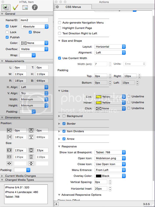
This is a snapshot of what my settings look like. I have gotten it to scroll before which is even more frustrating! Any idea?