Can anyone explain to me how an image and text popup can be made with xway ? Thank you.
Here is the what I have used, there probably many other ways as well…
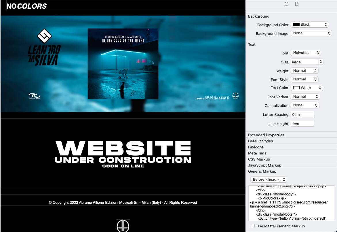
Place the code below under Generic Markup in the Before <head> section
Edit the “modal title” line and the Lorem Ipsum text in the “modal-body” section
You can also insert an image by placing a link in the “modal body” section, like:
<p><a href="HTTPS://link to your image in your 'resources' folder</p>
<link rel="stylesheet" href="https://maxcdn.bootstrapcdn.com/bootstrap/3.3.7/css/bootstrap.min.css" integrity="sha384-BVYiiSIFeK1dGmJRAkycuHAHRg32OmUcww7on3RYdg4Va+PmSTsz/K68vbdEjh4u" crossorigin="anonymous">
<link rel="stylesheet" href="https://maxcdn.bootstrapcdn.com/bootstrap/3.3.7/css/bootstrap-theme.min.css" integrity="sha384-rHyoN1iRsVXV4nD0JutlnGaslCJuC7uwjduW9SVrLvRYooPp2bWYgmgJQIXwl/Sp" crossorigin="anonymous">
<script src="https://code.jquery.com/jquery-3.2.1.min.js" integrity="sha256-hwg4gsxgFZhOsEEamdOYGBf13FyQuiTwlAQgxVSNgt4=" crossorigin="anonymous"></script>
<script src="https://maxcdn.bootstrapcdn.com/bootstrap/3.3.7/js/bootstrap.min.js" integrity="sha384-Tc5IQib027qvyjSMfHjOMaLkfuWVxZxUPnCJA7l2mCWNIpG9mGCD8wGNIcPD7Txa" crossorigin="anonymous"></script>
<!-- Popup Modal -->
<div id="popModel" class="modal fade" role="dialog">
<div class="modal-dialog">
<!-- Modal content-->
<div class="modal-content">
<div class="modal-header">
<button type="button" class="close" data-dismiss="modal">×</button>
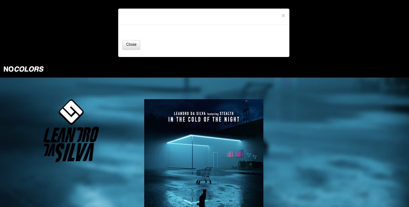
<h4 class="modal-title">Popup Title</h4>
</div>
<div class="modal-body">
<p>Lorem Ipsum is simply dummy text of the printing and typesetting industry. Lorem Ipsum has been the industry's standard dummy text ever since the 1500s, when an unknown printer took a galley of type and scrambled it to make a type specimen book. It has survived not only five centuries, but also the leap into electronic typesetting, remaining essentially unchanged. It was popularised in the 1960s with the release of Letraset sheets containing Lorem Ipsum passages, and more recently with desktop publishing software like Aldus PageMaker including versions of Lorem Ipsum.</p>
</div>
<div class="modal-footer">
<button type="button" class="btn btn-default" data-dismiss="modal">Close</button>
</div>
</div>
</div>
</div>
<script>
$(function() {
$("#popModel").modal('show');
});
</script>
1 Like
Not sure, are you sure that image is uploaded to your site?
Maybe someone else has some insight here….
Seth
Last, when I close the popup, everything disappears.
It’s also possible to use the CSS :target selector to display a popup without using JavaScript.
Here are some steps for doing this in Xway, which I’ve adapted from here.
Create a button:
- Insert a box and name it button-wrapper, using the Name/ID field of the Box Inspector
- Set its width to 40% (Dimensions section of the Box Inspector)
- Center-align it: choose Center from the Align popup in the Margins and Alignment section of the Box Inspecor
- Give it a top margin of 50px (this is just to move it down from the top of the page)
- Insert a second box within the first box, and name it button (Name/ID field)
- Give this a 2px solid Lime border, or choose a different color, if you prefer (Borders section of the Box Inspector)
- Give it a green hover background: choose Hover in the Dynamic Styles section of the Box Inspector, then choose Lime (or a different color) from the Background Color popup
- Choose Helvetica from the Font popup in the Text section of the Box Inspector
- Type “Show Popup” within the second box (button)
- Choose center alignment, using the Align control in the Paragraph Inspector
- Remove the minimum heights of button and button-wrapper: select each box in turn and delete their minimum heights in the Min/Max Dimensions section of the Box Inspector
The following steps add some minor tweaks to the button’s appearance:
- Select the button box, then choose White in the Text Color popup in the Text section of the Box Inspector
- In the Extended Properties section of the Box Inspector (just below the Text section), enter a property called border-radius and give it a value of 20px/30px
If you preview in Xway’s Web view, you should see a button with a green outline and rounded corners. It should say “Show Popup” (in white on a green background) when you hover over it.
Create an overlay
- Insert a box on the page, after button-wrapper: select button-wrapper, then insert a box using the Insert Box tool in the toolbar
- Name it overlay (Name/ID field in the Box Inspector)
- Set its background color to semi-transparent black: choose Other… from the Background Color popup in the Background section of the Box Inspector, then type 0 in the Hex field and 30% in the Opacity field of the New Color dialog
Create a popup
- Insert a box within the overlay box
- Set its Name/ID to popup
- Set its width to 30%
- Set its alignment to Center (Align popup in the Margins and Alignment section of the Box Inspector)
- Set its background colour to White
- Choose Helvetica from the Font popup in the Text section of the Box Inspector
- Add 20px of left/right/top/bottom padding in the Padding section of the Box Inspector
- Give it a top margin of 150px in the Margins and Alignment section of the Box Inspector
- To give the popup rounded corners: in the Extended Properties section of the Box Inspector (just below the Text section), enter a property called border-radius and give it a value of 10px
Create a close button
- Insert a box within the popup box
- Set its Name/ID to close
- Set its Position to Absolute
- Insert a multiplication symbol within the close box: click in the box, then choose Emoji & Symbols at the bottom of Xway’s Edit menu; then double-click on the multiplication symbol in the Maths Symbols section of the Character Viewer
- Set the top and bottom margins to zero in the Paragraph Inspector
- Set text alignment to center in the Paragraph Inspector
- In the Text section of the Box Inspector, set Size to 30px, and Weight to Bold
- Delete the box’s minimum width and height (in Min/Max Dimensions)
- Give it a width of 40px, delete the left offset, and set its right offset to 0px in the Dimensions section of the Box Inspector
Add some content to the popup
- Select the close box, and press Return to add some text after it
- Type “Popup”, followed by Return, followed by “This is a popup”
- Put a text cursor in “Popup” and choose Heading 2 from the Type popup in the Paragraph section of the Paragraph Inspector
Position the overlay
- Give the overlay box Fixed position: select overlay, then choose Fixed from the Position popup in the Style section of the Box Inspector
- Delete its width (Dimensions section of the Box Inspector)
- Add the following properties in the Extended Properties section of the Box Inspector: (1) name: right, value: 0, (2) name: bottom, value: 0, (3) name: opacity, value: 0, (4) name: visibility, value: hidden. This will cause the overlay to cover the view area when it is displayed, but be hidden by default
Link the button to the overlay box
- Select the button box, and set a Page link to the current page in the Link Inspector
- Choose overlay from the Item popup in the Link dialog (or Link Inspector) so the link targets the overlay box
- Select button-wrapper and set its link style to not be underlined: choose Link in the Default Styles section of the Box Inspector, then deselect underlining in the Text Decoration control
Link the close box to the page
- Select the close box and set a Page link to the current page in the Link Inspector
- Select the popup box and set its link style: choose Link in the Default Styles section of the Box Inspector, set Text Color to Black, and deselect underlining in the Text Decoration control
- Choose Visited Link in the Default Styles section of the Box Inspector, and set Text Color to Black
- Choose Hover Link in the Default Styles section of the Box Inspector, and set Text Color to Lime (or a different color)
Add some CSS markup
Lastly, we add some CSS markup to display the overlay and popup when the button is clicked. Enter the following markup in the CSS Markup section of the Page Inspector:
#overlay:target { visibility:visible; opacity:1 }
If you now preview in a browser, you should find that the popup is displayed in front of a semi-transparent black overlay when you click on the “Show Popup” button, and can be dismissed by clicking on its close button. (It doesn’t get dismissed if you preview in Xway’s Web view, but we should be able to fix this in a future version of Xway.)
Notes:
- The main purpose of button-wrapper is to allow link styles to be set on the link that wraps the button box.
- It would be nice to be able to close the popup by pressing Escape. This probably requires some JavaScript. My personal view of JavaScript is that it shouldn’t be required for essential functionality (not everyone has it enabled, although most people do) but it’s useful for extra functionality.