Scrutinizing SPARKLE (Freeway alternative)

I disagree insofar as my eyes don’t lie, and I know how to save graphics in Photoshop and use them as pass through graphics in Freeway.

In Freeway, if I import a graphic into an HTML box (which makes it a “pass through” graphic) and I then checkmark the “high resolution” setting in the Inspector, that graphic will display at 50% size (50% of the pixel dimensions I set for that box in Freeway) but the graphics content be twice the resolution (i.e., 144ppi vs. 72ppi). And when I create my graphics in Photoshop, I set the dimensions (matched to the pixel dimensions of the HTML container box in Freeway) and choose 144ppi.

In that knowledge I had created a comparison in the past showing a 72ppi passthrough side-by-side with a 144ppi pass-through and a 288ppi pass-through. And the 144ppi looked best to my eyes and was a reasonable filesize too.

If I turn a blind eye to ppi, I will no longer what what I will get in the browser, at least not when I design in Freeway, using an HTML container box of known, fixed dimensions.

I fully understand that RESPONSIVE sites that scale graphics throw a monkey wrentch into this, but I have never created a responsive size that scales the graphics, so I am only thinking about a static “retina” graphic here that is viewed at 100% of its designed size in the browser.

Now with scalable graphics, it’s different insofar as you won’t know all the ways it will be scaled necessarily, but you still need a starting point. And I would assume my personal rule still applies with regard to the largest physical dimensions the graphic in question would be displayed. So for example, if the largest (default) size of the graphic is to be 1000x1000 pixels, then obviously that would be put into a box in the web design app that is half those dimensions in order to yield a 144ppi “retina” output (if the target output is intended for retina display devices). But if the web design app also saves a normal resolution 72ppi graphic for display on non-retina devices, then it would still display within the same physical dimensions but its resolution be would half the retina version. That would be the default, starting point size which would scale in the browser according to whatever algorithm the browser uses to scale graphics.

This is how I’ve always thought about graphics I design, and I see what I expect when I view my Freeway output in various browser on the Mac, Windows, and iOS devices, some with normal resolution and some with high-dpi screens.

So while some may dislike terminology, my eyes don’t lie. I know what I am seeing. I design for it with pixel perfect precision, and it looks good, and that satisfies me.

James Wages


freewaytalk mailing list
email@hidden
Update your subscriptions at:
DPI and PPI are printing terms. A monitor is not a print. Every image that doesn’t fit your monitor space precisely at 100%, is re-sized (interpolated) either up or down - ‘on the fly’. There’s nothing else to know. DPI and PPI on a monitor are meaningless.


freewaytalk mailing list
email@hidden
Update your subscriptions at:

Terms have meaning as long as one gives them meaning. You are preaching semantics without speaking specifically of what I wrote in my previous post. As such, I stand firmly behind everything written in my previous post and would like to direct everyone’s attention to it.

James Wages


freewaytalk mailing list
email@hidden
Update your subscriptions at:

Terms have specific meaning, and it doesn’t matter if you want to assign a different meaning to them, that’s still not going to change their actual meaning.

If you remember printing ink on paper, there you need to know DPI, and it refers to the halftone dot pitch – the distance between the centers of the dots of ink that fool your eye into seeing a continuous tone image.

Digital photos have a pixel dimension in the X and Y coordinates. They also have a header (metadata) that nominally sets the PPI (pixels per inch) of the file, but that’s just the divisor. If you have a 1000 pixel wide image, and it’s set to 200 PPI, that doesn’t make it higher or lower resolution, that just means that an application that cares about PPI will interpret it as being 5 “inches” wide, but since displays haven’t been 72PPI since they came with beige cases, that doesn’t mean 5 actual inches, either.

Web browsers do not care about inches. They only care about pixels. And even if you have a Retina screen, the browser still thinks it is painting a normal resolution screen. It just gets to use 4 (or more, if it’s an iPhone 6s Plus) actual pixels for each “pixel”, and the operating system deals with those details.

When you check that box in the inspector that marks an image as high resolution, all you are doing is telling Freeway to make the image twice as large (in pixels) when it resamples the original. The CSS tells the browser to make the image 50% of its actual pixel dimensions, and that means that twice the actual image data is available for the OS to fill in the 4 actual pixels for every “pixel” on the screen.

This actually gets us back to printing ink, if you think about it. Remember someone telling you that you needed to make your image file twice the PPI of the DPI of your dot pitch? That was for the same reason, because if you didn’t have enough resolution, you would not get a clean halftone.

Walter

On Aug 27, 2016, at 8:12 PM, JDW email@hidden wrote:

Terms have meaning as long as one gives them meaning. You are preaching semantics without speaking specifically of what I wrote in my previous post. As such, I stand firmly behind everything written in my previous post and would like to direct everyone’s attention to it.

James Wages


freewaytalk mailing list
email@hidden
Update your subscriptions at:
Information for existing FreewayTalk / Groups.io users - Site Feedback - Softpress Talk


freewaytalk mailing list
email@hidden
Update your subscriptions at:
https://freewaytalk.softpress.com/person/options

I haven’t assigned a different meaning to the same terms I’ve been using for decades. The only change I made in the past is in going from DPI to PPI lingo, and even we Freeway users had talks about that subject at the time with folks from SoftPress.

I understand your way of thinking. But all I have been saying is that I prefer to have a MEANINGFUL “frame of reference” for my brain to make perfect sense of pixel data, in light of the resolutions I wish to design for.

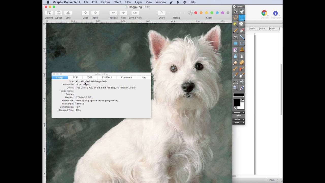
The following screencast with voiceover clearly shows why I said what I said in my previous two posts:

Thanks,

James Wages


freewaytalk mailing list
email@hidden
Update your subscriptions at:

I fully understand that RESPONSIVE sites that scale graphics throw a monkey wrentch into this, but I have never created a responsive size that scales the graphics, so I am only thinking about a static “retina” graphic here that is viewed at 100% of its designed size in the browser.

In some circumstance Sparkle can now create 30 variants of the same image. An image gallery with 10 images and 10 thumbnails would have 600 images. Would you be pixel peeping every one of those?

Duncan


freewaytalk mailing list
email@hidden
Update your subscriptions at:
https://freewaytalk.softpress.com/person/options

No, Duncan. I probably wouldn’t. Then again, I don’t use image galleries.

Did you watch my screencast and understand my explanation though?

James W.


freewaytalk mailing list
email@hidden
Update your subscriptions at:

There is currently a browser rendering issue with retina images in recent versions of Webkit browsers when viewed on non-retina displays that leads to significant image softening. Safari seems worse than Chrome.

The fix (sort of) is to add some page CSS until the developers fix this properly, so it works like FireFox.

I’ve thrown up a couple pages showing this problem. You can see it at http://www.sunnymede.net/css/ and then follow the link to http://www.sunnymede.net/retina/ for comparison.

Ashley


freewaytalk mailing list
email@hidden
Update your subscriptions at:

On 28 Aug 2016, 12:12 am, JDW wrote:

Terms have meaning as long as one gives them meaning.

Quite hard to have a meaningful discussion with someone who is inventing their own meanings. :slight_smile: :slight_smile:

Whatever works for you is fine. I was simply pointing out that you are misunderstanding what ppi and dpi mean as far as computer screens/monitors are concerned. It is a massively common misunderstanding, so don’t feel too concerned about it.


freewaytalk mailing list
email@hidden
Update your subscriptions at:
https://freewaytalk.softpress.com/person/options

Ashley, I have discovered the same. On my Freeway sites, I have all my graphics changed to “High-Resolution” (2X, 144ppi, what have you), and I have noticed that my graphics are soft (non-ideal) in most browsers.

The solution here is for our web design tool to auto-generate sharpened 1x/72ppi/NormalRez graphics along side the Retina graphics, then sense the resolution of the viewer’s device and display the appropriate graphic. Freeway does NOT do that for us. But it seems that Sparkle does do that?

And again, for those who think ill of me for daring to use “ppi” please watch my screencast to see the logic behind using it as a mere “frame of reference for intelligent design purposes.”

As you can see in the screencast, that lingo is not exclusive to me. You’ll find it in any graphics editor. It makes a lot more sense to me than merely saying “2X” because when you say that you are left wondering “2X of WHAT?”

Thanks,

James Wages


freewaytalk mailing list
email@hidden
Update your subscriptions at:

@ Duncan

Do you now know why I wrote the allegedly offending topic above? The one you mentioned “against Sparkle”? The one I said “having nothing to do with Sparkle … having to do with results?”

“Even when the web-world thinks having the gist - a Freeway-user knows better!”

I basically was under the impression having understood “responsive concept”. But after reading all this stuff I’m not that sure anymore.

Very confusing - to be honest. And a good argument for Sparkle: Let the experts there decide what’s best. And I’m sure it’ll be a very good choice.

Cheers

Thomas

Shouting this from the corner of the room (although I should be banned from it anyway).


freewaytalk mailing list
email@hidden
Update your subscriptions at:

Very confusing - to be honest. And a good argument for Sparkle: Let the experts there decide what’s best. And I’m sure it’ll be a very good choice.

I figure you mean well. The point is the market for selling a handmade website doesn’t sustain the cost of keeping up with technologies.

Duncan


freewaytalk mailing list
email@hidden
Update your subscriptions at:
https://freewaytalk.softpress.com/person/options

@JDW In testing I discovered I could obtain smaller file sizes and sharper results on non-retina displays with highly compressed retina resolution images thanks to the vagaries of pixel density. They also look great on retina displays where normal resolution images look soft.

All was well until changes were made a few months ago to webkit browsers and suddenly everything was mushy on Safari or Chrome. The CSS script I applied just about fixes it. I’ve not used Sparkle but this problem is browser based, therefore it’s the same for everybody.

In Rapidweaver there are various stacks and scripts that will load a non-retina image initially then serve up a retina version if they detect a retina resolution image. I tried a couple options but was never entirely satisfied.

Try visiting http://www.sunnymede.net/retina/ in Safari and drag the browser window with your mouse to make it wider or narrower. You should instantly see the images become sharper but the moment you release the mouse it becomes soft again.

I have reported this problem to both Google & Apple and I know Apple at least were taking a look, but nothing has yet been done. FireFox always looks great.

In theory, yes we could provide standard resolution images to non-retina displays, but that’s a step backwards when you can achieve smaller file sizes and sharper images using one set of retina ready images on all screens. Webkit needs to sort this out.

On a side note, I have found that automated tools for downsizing retina ready images tend to deliver poor results. The best method I have found is to save for web in Photoshop at double the intended size on screen, since Photoshop defaults to 72ppi, then preview at 50% and bring down the compression slider until the visual quality starts to suffer.

There are lots of additional factors to consider if performance is an issue, such as the way files are delivered via http or http2 and CloudFlare Pro offers a brilliant algorithm for compressing images without loss of quality, but that is a whole different topic.

Ashley


freewaytalk mailing list
email@hidden
Update your subscriptions at:

All was well until changes were made a few months ago to webkit browsers and suddenly everything was mushy on Safari or Chrome. The CSS script I applied just about fixes it. I’ve not used Sparkle but this problem is browser based, therefore it’s the same for everybody.

In Rapidweaver there are various stacks and scripts that will load a non-retina image initially then serve up a retina version if they detect a retina resolution image. I tried a couple options but was never entirely satisfied.

Sparkle does indeed use state of the art techniques to load the appropriate image, based on the browser used. This is more or less what it boils down to, the mix of HTML, CSS, Javascript and experimentation to nail this is quite a bit of work:

  • on Chrome 25+, Safari 10+ webp images are served directly, these are about 25% smaller than corresponding JPGs or PNGs (this is via picture element with mime type qualifier)
  • on Safari 9+ and Firefox 38+ the exact image, both in resolution and density, is served to the browser, and no other unneeded asset is downloaded (this is via the picture element)
  • on earlier browsers the smallest image of any device is specified in the HTML, and as soon as Javascript kicks in the correct size/resolution image is loaded (this is equivalent to using picturefill but a lot more lightweight)

If you’re doing this manually you’ll be tempted to brush it off and say “meh that’s good enough”. In that case… more power to you?

There are lots of additional factors to consider if performance is an issue, such as the way files are delivered via http or http2 and CloudFlare Pro offers a brilliant algorithm for compressing images without loss of quality, but that is a whole different topic.

http2 actually only interleaves requests potentially reducing latency (but since servers aren’t optimized for short jobs it actually ends up increasing latency of smaller resources on average), CloudFlare’s Polish does compress images but most likely nothing you couldn’t do yourself.

Duncan


freewaytalk mailing list
email@hidden
Update your subscriptions at:
https://freewaytalk.softpress.com/person/options

My reference to performance and servers was more about the way items can be downloaded concurrently, so a web page that weighs 1mb may not necessarily load any slower than one of 500kb or at least to within a few milliseconds. I also gather some of the traditional best practices for page speed performance are potentially counterproductive for http2.

CloudFlare’s Polish + Jpeg is helpful for those who would struggle to all of this on their own. Many people just save a Jpeg without too much thought and upload it to the server, so Polish might save well over 50% on the image size with the added bonus that images are cached near the user via the CDN. Mirage is another trick they offer for mobile.

I’m quite impressed Sparkle is taking those steps in the background for image handling, assuming the final results are quite good. It’s certainly an advanced approach for built in functionality.

Ashley


freewaytalk mailing list
email@hidden
Update your subscriptions at:

@James

Freeway’s “Retina” checkbox was never intended to “create” retina images, it’s more likely there to indicate Freeway to use an image twice the pixel-width (dimension) within your artwork.

####Lingo

The standard screen definition for images in web is 72 dots per inch.

####Retina

It is still 72 dots per inch, but twice the dimension of your image.

####In Freeway

Assumed your dog.jpg shall be the hero-image of your page. It’s 960px wide and has 72dpi. Your page-width in Freeway is as well max-width: 960px.

As standard you’d place it and good.

For retina, you’d now have to double its dimensions, using whatever application.
You end up in a (pretty blurry) 1920px wide - but still 72dpi - image. Save it as dog-large.jpg.

Now draw your HTML item and pass-through your dog-large.jpg. Initially, the html-frame will explode the dimensions of your page-width, right? Now check the retina check-thing and it will shrink down to the expected 960px.

Set the width to 100% (height auto) and you’re even responsive.

####Conclusion

Preferably leave everything on 72dpi. Figure out the pixel-width and argue:

Twice (1.5, 3x whatever) of the given pixels!

####If your reaction is now:

“These look great. I’d wish it would be a bit more complicated”, you’re in luck.

Because the challenge for now is to ask yourself: Wouldn’t it be better to serve different varieties of this image and let the browser decide which one to take? And that’s what Duncan is referring to and Sparkle manages for you - and Freeway never did. We had more the “either … or” approach.

To me it’s an authors responsibility - and not a machine’s. But that’s another chapter of the book. And yes - with Sparkle you’d be in a safer space.

Cheers

Thomas


freewaytalk mailing list
email@hidden
Update your subscriptions at:

All true, except two things – it’s pixels per inch (dots are for ink), and the browser really does not care about the ppi metadata. It shows pixels. Save the same file at 72ppi or 144ppi or 288 ppi – put them side-by-side as pass-through (or just hand-code it) and you will see two or three identical images. The CSS (what you get when you click the High-resolution check-box) defines what size an image should display at, and the rendering engine in the browser resizes the image on the fly to fit.

Here’s an example to prove the point. View source – and download the images and open them in Photoshop to see what I am talking about here.

http://scripty.walterdavisstudio.com/annie

Walter

On Aug 29, 2016, at 8:30 AM, Thomas Kimmich email@hidden wrote:

It is still 72 dots per inch, but twice the dimension of your image.


freewaytalk mailing list
email@hidden
Update your subscriptions at:
https://freewaytalk.softpress.com/person/options

I am following this discussion with much interest and trying to “get it”.
Very confusing for a print-oriented girl. Was easy to understand web images before Responsive came along. The lingo was familiar to me, as others have said.

@Duncan: Using Sparkle, if I save my images as 288 ppi will that be a safe bet or ? The images need to look good.

Thanks to everyone who is contributing to this thread. It’s helpful and very interesting!

joette/redfeather


freewaytalk mailing list
email@hidden
Update your subscriptions at:

Again, the PPI is not relevant at all. When you save a PNG or JPEG or GIF from Photoshop, using the Save for Web and Devices exporter, the PPI header is stripped out (along with a lot of other metadata) because it is just going to be ignored by the browsers. When you open a file that has come out of SFW in Photoshop, it will appear to have 72ppi, but that’s just because that’s what Photoshop’s default is for images that don’t have a specified PPI.

So the only relevant and important measure is pixel dimensions (width and height), not PPI. If you want your image to take up half the width of your page, and you’ve set your page to 960px wide, then you will need an image to display at 480px wide (at 72ppi), so you need to make the actual image file 960px wide to get @2x size, or 1440px wide to get @3x (for the iPhone 6 Plus). Anything larger is a waste, although it sounds like Sparkle does a nice job of down-sizing images to the target dimensions.

Walter

On Aug 29, 2016, at 1:16 PM, redfeather email@hidden wrote:

I am following this discussion with much interest and trying to “get it”.
Very confusing for a print-oriented girl. Was easy to understand web images before Responsive came along. The lingo was familiar to me, as others have said.

@Duncan: Using Sparkle, if I save my images as 288 ppi will that be a safe bet or ? The images need to look good.

Thanks to everyone who is contributing to this thread. It’s helpful and very interesting!

joette/redfeather


freewaytalk mailing list
email@hidden
Update your subscriptions at:
Information for existing FreewayTalk / Groups.io users - Site Feedback - Softpress Talk


freewaytalk mailing list
email@hidden
Update your subscriptions at:
https://freewaytalk.softpress.com/person/options

@Walter: So, if the image were to fill the entire page for example, and if using the one image for everything approach Sparkle seems to have:

If the page size was 960px wide, the image would need to be 1920px wide for 2x?

For image galleries, I would start with the largest size a particular image would be, not the thumbnail in the gallery and do the math to figure out how much of the page it would take up and make it twice that size? The thumbnails would be figured out the same way – the amount of page they take up x 2. Yes?

Thanks!
joette/redfeather


freewaytalk mailing list
email@hidden
Update your subscriptions at: