What the Action can do: This Action lets you do the following:
- It lets you create buttons for your website using two basic themes along with many different effects.
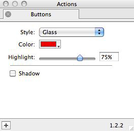
To use the Action, click on the Graphic tool on Freeway's tool bar and draw an item on your page. With the item selected, go to Item>Actions and choose Buttons. With the item selected on the page you can see the options in the Actions palette:

Note that options available in the Actions palette are very different, depending on which choice you make in the Style popup. By default, the Style popup is set to Glass, which gives a live preview of the effect on the graphic item on your page.

- Color: Click and hold on this popup to choose the color you want to use for the button in this color popup.
- Highlight: Use the slider (or value field) to change the "highlight" (or shine) effect used on the item.
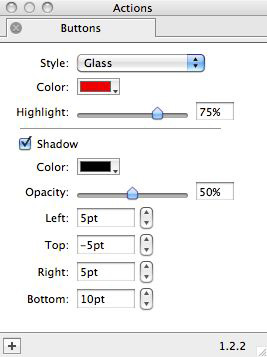
- Shadow: Check this option if you wish to apply a soft outer shadow on the button graphic. When checked, more options appear.

- Color: Click and hold on this popup to choose the color you want to use for the shadow on the button.
- Opacity: Choose a value (from 0% to 100%) to give transparency to the shadow effect.
- Left, Top, Right and Bottom: Enter a value in points (or use the up and down arrows) to set the offset between each edge of the graphic and the shadow effect. Note that changing the value will make the graphic button smaller rather than the shadow effect (the shadow stays where it is) and it is also worth pointing out that although you can apply a negative value, it will have no effect.

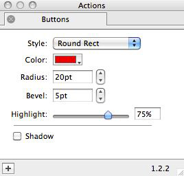
- Color: Click and hold on this popup to choose the color you want to use for the button in this color popup.
- Radius: Enter a value in points (or use the up and down arrows) to change the corner radius on the button. The higher the value the larger the corner radius.
- Bevel: Enter a value in points (or use the up and down arrows) to change the width of the "bevel" (the 3D effect used on outer edge of the button). If you do not want a bevel to be used, set the value to 0pt.
- Highlight: Use the slider (or enter a value) to control the "highlight" effect. Unlike the Glass button effect, this is simply just a graduate fill which changes from the pure color to a darker hue - and note that the Bevel effect is simply a reversed graduated fill of the same color which gives a 3D effect when used in conjunction with the Highlight effect.
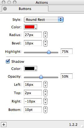
- Shadow: Check this option if you wish to apply a soft outer shadow on the button graphic. When checked, more options appear:

- Color: Click and hold on this popup to choose the color you want to use for the shadow on the button.
- Opacity: Choose a value (from 0% to 100%) to give transparency to the shadow effect.
- Left, Top, Right and Bottom: Enter a value in points (or use the up and down arrows) to set the offset between each edge of the graphic and the shadow effect. Note that changing the value will make the graphic button smaller rather than the shadow effect (the shadow stays where it is) and it is also worth pointing out that although you can apply a negative value, it will have no effect.