What the Action can do: This Action lets you do the following:
- It lets you set up an automatic redirect on your Home page (or any other page it's applied to) which will take visitors using certain mobile phones or tablet devices (including iPhone and iPad) to a different page - perhaps the home page of a duplicate site optimized for viewing on smartphones or tablet devices.
The most popular way to use this is to apply the Action to the site's normal Home page, then you can build a duplicate set of pages and set the Action to redirect to the Home page of those device-specific pages.
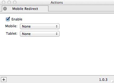
To use the Action, make sure nothing is selected on the page, go to Page>Page Actions and choose Mobile Redirect. With nothing selected on the page you can see the options in the Actions palette:

- Enable: This option lets you switch on and off the functionality of the Action so you can remove it without needing to set it up again from scratch should you decide to use it again at a later time.
- Mobile: Click and hold on this popup to choose the page you want to redirect smartphone visitors to. This can be either an existing page of your Freeway file, or you can choose Select…, then choose an external page by clicking on the External tab of the Edit Hyperlinks dialog and entering the http:// address of the page you wish to use for the redirect.
- Tablet: Click and hold on this popup to choose the page you want to redirect tablet device visitors to. This can be either an existing page of your Freeway file, or you can choose Select…, then choose an external page by clicking on the External tab of the Edit Hyperlinks dialog and entering the http:// address of the page you wish to use for the redirect.
- Smartphones: iOS (iPhone/iPod), Android, Blackberry, Windows, Symbian, Palm
- Tablet devices: iOS (iPad), Android, Windows, Playbook
Setting the page structure in your Site Folder to use the Action
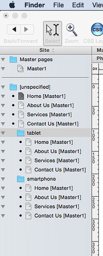
All you need to do is to apply the Mobile Redirect Action to the first page in your Site Panel (ie, the normal page for desktop browsers) and then choose the "Home" page in the "tablet" page folder for your tablet-specific pages, then choose "Home" page in the "smartphone" page folder for your smartphone-specific pages. See a sample recommended page structure screenshot below.
If you change the page width of the pages in the "tablet" page folder to 760px (which matches the iPad's screen width) and the pages in the "smartphone" page folder to 320px (to match the iPhone's screen width) you will not go far wrong.
Because the Home page at the top of the Site Panel list has the Mobile Redirect Action applied to it, that will mean that tablet users will automatically be redirected to the Home page in the "tablet" folder and smartphone users will automatically be redirected to the Home page in the "smartphone" folder (so you don't need to apply the Action to any other pages).
