Hi guys’n gals,
with the idea of adaptive content, we now know, that it’s mainly about adjusting one single set of HTML (content) to all (most) thinkable devices and browser-situations the best we can.
I’m exclusively talking about images and doable concepts handling those often heavy weighted resources. Especially if it comes to hero images they are more than often huge (if not to say crazy huge) 300-800kb. We need a clever and more selective solution.
####The CSS way
In Freeway we call this “background-image” and it’s fairly easy to do. Just “replace” them on lower breakpoints by smaller versions - done!
####The Tag
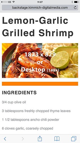
Did I already mentioned that we do a “single set of HTML”? The img-Tag IS HTML so we won’t have a chance to simply replace them for lower breakpoints. But with Picturefill there seems to be a solution. I don’t want to go in details here, but I gave it a go. Once I am aware what I did, I try to wrap this in a video-screencast. But before I do, I beg your help:
Call the shared link on several devices such as cell-phone and tablets and tell me if:
Tablets call the 1200px image version and cells the 600px version?
Browsers are redundant (in fact it should work in Safari and Chrome but not in Fox).
http://backstage.kimmich-digitalmedia.com/testings/imageresize/img-res-adjusted.html
And another thing I probably miss:
I did the example on the img-Tag but how would one create natively a picture element, necessarily with srcset and sizes, something like:
<picture>
<source srcset="examples/images/extralarge.jpg" media="(min-width: 1000px)">
<source srcset="examples/images/large.jpg" media="(min-width: 800px)">
<img srcset="examples/images/medium.jpg" alt="A giant stone face at The Bayon temple in Angkor Thom, Cambodia">
</picture>
I thank you for your kind help in advance.
Cheers
Thomas
http://backstage.kimmich-digitalmedia.com/testings/imageresize/img-res-adjusted.html
freewaytalk mailing list
email@hidden
Update your subscriptions at:
