The strangest thing. This one was a quicky … client wants to sell their vacation house, so they asked me to to create a page for the sale.
When viewing this page ‘mobile’ there is a hamburger (mobile menu), which works just fine. However, just navigate to any item, and then hit the hamburger again to activate te menu … behind it you’ll see the page scrolling back to top in the meanwhile. Is this expected behavior?
Hi Richard - I’m not sure what the menu problem is, but your Home link is #nil and there is no item on the page with the id of “nil” and so I think
it’s bad to have this ambiguity. Better to point it towards an existing
item (#PageDiv) or simply to the index.html to reload the page.
The menu isn’t persistent (on my Chrome Version 39.0.2171.95 (64-bit)) so
the whole Home thing seems odd, anyway. Sometimes I had two hamburgers -
one to open one to close. Sometimes it was invisible but clicking brought
it out. I wonder if with small and simple (but nice, I very much like it)
site like this you might invest in writing your own menu – which may give
you some perspective on the action version. Everything has its strengths
and weaknesses.
Hi Ernie! Indeed the HOME menu item still was linked to (the default CSS MENU state) #nil. I’ve just corrected en re-uploaded it. It just surprised me that apparently some items appear on top of the menu, even though it has an z-index of 9999.
I’ve just corrected en re-uploaded it. It just surprised me that apparently some items appear on top of the menu, even though it has an z-index of 9999.
My goodness, how could I even miss that one. Thanks David!
Well … that leaves us with the great mystery regarding the ‘back to top’ when activating the ‘responsive menu’. As soon as the menu is activated, the page immediately scrolls to top in the background. That one still puzzles me.
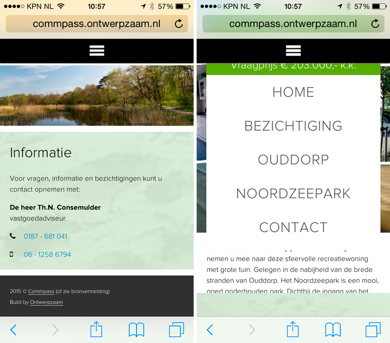
Left : Current position (bottom of page), now open the menu.
Right : Menu is opened, and notice that the page has scrolled back to top.
that leaves us with the great mystery regarding the ‘back to top’ when activating the ‘responsive menu’.
I think I would move the CSS Menu directly into the nav-container so it wasn’t nested - then you can get the nav full-width when it opens which it isn’t doing just now. ie nav-container becomes the CSS Menu item.
Nope … no difference. No matter what I do, the page scrolls back to top as soon as you activate the (responsive) menu. Normally the overlay color covers that, so you won’t notice this happening …
That’s really odd, perhaps it’s a jQuery thing, since the Freeway default menu interaction does not require a library at all. Why are you using jQuery on this page? When you click the hamburger, all you are doing is clicking on the label for a hidden checkbox – you’re not clicking an anchor link, which is ordinarily the only thing that can scroll the page.
If you’re using a jQuery smooth scroll effect, have a try removing that entirely and using the (Prototype/Scriptaculous) SmoothScroll Action instead. Remember, you have to get rid of every trace of jQuery before that will work at all.
Just to see if I could, I made a “hamburger” menu without any JavaScript at all: Mobile Menu
View source, it’s all done with CSS.
Walter
On Jan 3, 2015, at 8:31 AM, Richard van Heukelum email@hidden wrote:
Nope … no difference. No matter what I do, the page scrolls back to top as soon as you activate the (responsive) menu. Normally the overlay color covers that, so you won’t notice this happening …
In fact it is indeed loaded for the smooth scroll effect. I’ll try the SmoothScroll action and see what happens. So, jQuery and related SmoothScroll script are now deleted, and I used the SmoothScroll Action …
As you can see, it still happens. It seems to mee that to avoid this you will have to use a solid Overlay color or else … and this I just don’t want to be obliged to do, just to hide a glitch in this feature.
Just to see if I could, I made a “hamburger” menu without any JavaScript at all: Mobile Menu
View source, it’s all done with CSS.
This is awesome.
It would be nice if something like this (a pure css responsive menu) is made optional for Softpress’ official CSS Menus Action (select js for smooth, or select pure css for plain-and-simple). Perhaps this can even be combined with some animate.css functionality as shown here: Redirecting to Animate.css. Thanks for this one!