Thomas, you have screencasts on the following topics:
Box in Box Model FW Pro 5 BASICS
Box in Box Model FW Pro 5 RESPONSIVE
Box in Box Model FW Pro 6
Stone Oven Template
GridMeister - BoxModel FW Pro 7+
CSSMeister
Do the new FW7 videos rely upon the old FW5 and FW6 videos? In other words, do we need to watch the FW5 and FW6 screencasts if we have FW7? (It seems that “GridMeister” only applies to the FW7 video set.)
Hi James … whilst this is an old post I’m also feeling a little frustrated trying to get my head around ‘Responsive’ - I’m about to enter Thomas Kimmich’s ‘lounge’ but did you ever find any other resources that made your responsive journey happier ?
Best Roger
freewaytalk mailing list
email@hidden
Update your subscriptions at:
NO. I’ve still not created a responsive website. I decided that my journey would not be a happy one at all if I tried it. My consolation was that my existing sites work well enough and look fine on iPhones, iPads and desktop computers too, so why put forth the effort to create a responsive site? I couldn’t justify it.
Now if a future version of Freeway could make it easy, and I don’t mean “templates,” then I would reconsider it. But for now, I am no longer considering it at all. And I say this after having done some serious study on how to accomplish it. I lack time and patience and motivate to change my huge websites over to that format.
Best,
James W.
freewaytalk mailing list
email@hidden
Update your subscriptions at:
Thanks for the prompt response (excuse the pun) James … I’m going to begin the journey again (having tried several times over the last few months) but maybe I’m a little like you “I lack time and patience and motivation” though unlike you I probably lack the brain cells to get my head around it. I also am concerned that most responsive websites look the same … like a newspaper with columns and boxes in regimented order, I’ve always tried, during my long design career to get away from that sort of formality … we will see.
Roger
freewaytalk mailing list
email@hidden
Update your subscriptions at:
I use my iPad all the time and I hate it when I get fed a MOBILE version or what looks to be a mobile version of a website. I prefer to view the DESKTOP version where possible because almost always the desktop version contains more information and features.
To give you an idea of why I haven’t converted my 2 big sites yet (Japanese and English, for 4 sites total), have a look:
Browse those sites and see just how much information is there, then ponder how would you would go about taking all that information and completely redesigning it to be Responsive. I’ve determined it would take much, much too long, and I don’t even know if I could get a responsive site to present the information in the way I want.
Best,
James W.
freewaytalk mailing list
email@hidden
Update your subscriptions at:
… I also am concerned that most responsive websites look the same … like a newspaper with columns and boxes in regimented order …
For years, the web community suffered “turning” web-design into “print-design” and vice versa. While this basic attitude is wrong anyway, I wonder what’s wrong, now that we are closer to it than ever. The problem is, that you lost (or never had) the gist of web-design which is not the “make me pretty” discipline - it’s about content - structuring it and present it on all devices the best we can (columns, rows).
You guys are missing patience for continuing an evolving medium?
I show great understanding.
But please understand in the same way, that me personally is sucked as well. Web Design persists for me of two words. Web and Design. This audience neither showed a tendency to the one nor the other.
I’m the all-time badass of the board - even responsible for dropping friendliness of the most friendly board ever. People alleging me sarcasm. And why?
I’d like to prevent a great app from unfair distribution.
But you know what? I expected it. From the very first time I did adaptive stuff in Freeway (5.6.5) back in 2012 I expected this audience would fail. A pity though - but not to change. But there is hope: Web-design is a profession - and there are professionals out there even for to hire.
Converting existing sites into responsive only might work when it’s a small/simple site to begin with. Otherwise you’d have to start from scratch. So I do get your point completely James.
Without being contemptuous, setting up a responsive site with Freeway7 (or 6) ain’t that hard though. One thing I am absolutely convinced about however, is that you will have to work with a boxed model layout/inline layout/hybrid layout … Note - it would be nice if we’d use one name for this.
It would be nice if Freeway was able to use today’s measurements like 'vw, vh, etc. or incorporated flexbox, but it still doesn’t. So every now and then we just have to dive into ‘extended’ in order to do some screwdriver work ‘under the hood’. Not necessary, but being able to do this can become handy at times. Learn to work with CSS and how to overwrite settings.
Setting up your document is the place to start; so determine the maximum width of your flexible website (let’s say 1200px), use HTML5, external stylesheets, select your language/encoding, common Resource folder, readable HTML code output and -at mobile settings- set ViewPort Width to ‘Device Width’ (leave ViewPort Height alone), check ‘Page can be scaled on mobiles’ and ‘Initial scale’ and set Initial scale to ‘100%’. Yes, there are more settings available, but these are the main ones.
Rename your master page appropriately and start setting up the basics; check the setting in the Inspector palette. Set the page width to 100% (dimensions) and the width of 1200px you’ve set up in the document setup will appear as width in ‘measurements’. That’s just for your display purposes; it’s the 100% (flexible) width that will count at the end.
Double click in the page and a blinking cursor will appear, now insert your first HTML item. Remember … you’re working inline, so all inserted HTML items (or rather ‘div’s’) will initially lock at the top left corner. You’ll need to position these divs using margin.
With his first div selected go to your inspector and set the width to 100% (fixed (%)), give it a max-width of 1200px and center it horizontally (which will accomplished by giving it a margin-left and -right of ‘auto’). Insert a reasonable amount of lorem-ipsum into this div, and remove the fixed height (flexible). Now preview this in a browser and drag your browser window narrower and wider. Notice how the width of the div will grow and shrink according to the browser window (the viewport). It won’t grow as much as 1200px wide, just like we told it to.
When you get this … the rest is just around the corner.
freewaytalk mailing list
email@hidden
Update your subscriptions at:
Thomas and Richard, thank you for the encouragement. But I can’t get my head around basic “CSS positioning” most of the time. How then can I expect my brain to comprehend how to accomplish a complete redesign of my existing websites? (Return to my previous post and view all 4 of those sites and see the extend of the content there – ponder it deeply.)
With regard to CSS positioning, here is but one example:
The box with the pink outlines, inside which you see the “LinkBtn” selected is a TABLE. I tried in vain numerous times to avoid use of tables by making that purely CSS. But I have found it ridiculously hard to use only CSS positioning to replicate that box; and in the end, I could not accomplish it.
One may try to say to me, “Just change the look of it to achieve a purely CSS positioned design.” Easier said than done. I design only things that come into my brain. I think it, then I want to design it. I know how to take my analog thoughts into the digital realm via Freeway using tables, most of the time. It’s WYSIWYG easy stuff. But with CSS, it’s a horrid experience.
Think about that pink box for a moment. Note that I have the white “1” at left centered vertically and horizontally. To the right of that, I have a 144ppi retina graphic logo centered vertically, and to the right of that I have HTML text, and to the right of that I have 2 buttons (styled by CSS in the HTML Markup dialog) that are vertically position as I want them to be. Everything in that box also has a proper horizontal gap so no content slams against the rest. And I have confirmed it looks fine to my eyes in all Mac and Windows browsers (the latter being IE8 and higher).
But trying to clone the exact look of that box using purely CSS positioning instead of tables is not a fun job in Freeway. And “CSS positioning,” in my mind anyway, is a tiny matter relative to a full redesign of a website using Responsive techniques.
If I cannot get my head around CSS positioning, how then can I expect to redesign a website as Responsive? And even if I was cerebral enough to understand all the code hacks required, the fact remains that design needs to be FUN for me to be inspired.
If I need to design a web page with somewhat complex content that is vertically and horizontally centered, I know I can create that in literally SECONDS using a table. And I get satisfaction using Freeway’s Table tool to accomplish the task. But to jump around into multiple markup dialogs and in the end design something that looks like a mess in Freeway (i.e., something not very WYSIWYG), is foreign to my right-brain way of thinking. It just kills my creativity. I am mentally exhausted by it. I have no drive to go on.
That’s my problem. And surely I am not alone.
–James W.
freewaytalk mailing list
email@hidden
Update your subscriptions at:
Using and loving freeway for about 10 years I guess until I had to do the responsive design process. Much the same as your frustration and tried to dive into Wordpress (yuk) until I read in this forum someone mentioned Rapidweaver, Stacks 3 and Joe Workman’s Foundation framework. Stacks 3 has changed the game for Rapidweaver. Revolutionary. And after converting a 150 page site and learning the process for two months, I was amazed. Sites been up about 7 months and things are really easy now. I’ve been very hesitant to mention this on this forum, but it’s more about helping those who are frustrated. Purest construction or not, it’s about getting my business where we can do what needs to be done. I really hope Freeway 8 will make this process easier. There’s a lot to like about Freeway and the support on here. I keep my eye on it every day.
freewaytalk mailing list
email@hidden
Update your subscriptions at:
I have downloaded and tested various RapidWeaver version in the past, and in every case I was not impressed at all. The reason is because Rapid Weaver is basically a template-driven design app, which really isn’t a “design app” in my opinion. However, your mention of Stacks 3 had me curious so I reviewed the info on their site. Looks like someone finally helped Rapid Weaver to break out beyond templates, into the realm of real design. However, it also looks to be a rather expensive proposition, if you want a lot of bells and whistles, as per what I see on the following page:
On 19 May 2016, 10:32 am, Richard van Heukelum wrote:
Converting existing sites into responsive only might work when it’s a small/simple site to begin with. Otherwise you’d have to start from scratch…
“…a small/simple site to begin with” — This is true. I converted my nonresponsive Freeway website into responsive. It took me several months, because it was about 350 pages. But in the end, it was worth it. All the pages now pass both Google’s and Bing’s mobile test tool.
Hi James, I’m by no means one of the guru’s here, and I’m not brilliant at responsiveness (I still have trouble doing a whole site in Freeway and have to resort to the lifesaver that is Backdraft more often than I would like), but quite honestly, if I can get my head around it, then I’m pretty sure a box of brains like you can.
Once I got it into my head to construct the page like a page layout type box (albeit using percentages for size), and insert the cursor for placing things, then something clicked, as that’s the sort of background I come from. From here, it’s just a matter of playing with floats, clears (I still have trouble with both of those), margins and padding and an awful lot is possible.
This worked for me, I’m not saying it’s for everyone, but just taking it from a different angle rather than drawing random boxes and hoping for the best.
Basically, from my limited knowledge, the ONLY way to get responsive is to follow the above by inserting various items within an outer holding box.
best of luck. It’s not as simple as people make it sound, but doable with trial and error.
Trev
freewaytalk mailing list
email@hidden
Update your subscriptions at:
Web design is not my full time job – only one small part of it. I don’t have time to burn. Sometimes, I need to make significant changes quickly. With the existing design of my sites (which is not responsive) I myself am “responsive” when it comes to making those big changes fast. I just don’t see how that would be true if I even were able to redesign my sites to be fully responsive.
Again, I must take you back to my “CSS Positioning” example. Have a look at this again…
Boggled minds or no, I consider speed and efficiency critical issues.
If it takes me 5 clicks and 2 minutes to create something good, why should I spend 50 clicks and 20 minutes to create something that is only marginally better?
Sure, responsive is better than the sites I have now. But is it 200% better? I would say, no, it isn’t.
How much better is the end product versus the time and effort I must put in to create it?
The reason I put forth that CSS POSITIONING example is because it illustrates a very basic task that should be lightning fast and easy for anyone to accomplish. And it is, if you use a table to do the job. But if you go the CSS route, you don’t go the intuitive route and it takes you a long time, and in the end you find you cannot replicate that object to match the look of the table.
Try it. Clone my table using purely CSS positioning. Count the clicks and set your timer. Pit that against the clicks and time it takes using a table.
That is how I consider Responsive layout. It just takes too much time and it’s not WYSIWYG. To me, traditional layout using tables in Freeway is as intuitive as the Macintosh 128k back in 1984, whereas Responsive layout is like DOS or CP/M in comparison. With traditional layout in Freeway, I really never needed to consult a manual when doing basic layout. That is not true of Responsive design.
I could go on, but I think you get my point, even if you Responsive design experts disagree with my stubbornness pertaining to “WYSIWYG.” Responsive design, as it stands now in Freeway, is not for everyone.
–James W.
freewaytalk mailing list
email@hidden
Update your subscriptions at:
As a web-designer (my side job!!!), I had to learn, it is the Visitor’s need to cover rather mine or my clients personal preferences. So the question is increasing UX. I understand myself as part of the service industries - and this requires to be aware of ALL tools available.
Tables are still part of “positioning” content - agreed. Specific content to be pedant, though. Rather telling me trying things out that I’m aware of, better ask yourself:
My suggestion to Softpress is that they allow two approaches to responsive – the existing approach, and another that allows certain elements to completely opt out of the cascading approach. This is a big deal when considering the huge range of variable space when resizing a page horizontally on a huge monitor.
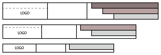
Here’s a sketch of something I posted on another thread that I’m trying to achieve in Freeway but without success:
Tumult Hype has this sorted well - Creating the next breakpoint brings the content along from the larger breakpoint, but you can then change anything without it affecting things at other breakpoints. If you delete something that is not needed for a narrower breakpoint, it is not deleted from any other breakpoint.
The workaround I’ve had to go with has been to create the header bar and menu in Hype and place it within a markup item in an inline layout in Freeway. Dealing with the links is a headache and, frankly, it would make better sense to do it totally in FW.
freewaytalk mailing list
email@hidden
Update your subscriptions at:
My suggestion to Softpress is that they allow two approaches to responsive – the existing approach, and another that allows certain elements to completely opt out of the cascading approach. This is a big deal …
Without any sarcasm (keeping countenance is hard though):
A big deal to whom?
This is called display:none and is inspector’s third tab (display check or uncheck). Any approach starts from one set of elements which can be re-arranged or displayed however you like to whatever device-width.