Responsive squares using viewport values

In order to create responsive square de height of the div’s need to be the same as the width. You can’t do this within the standard Freeway given options, so there’s a workaround for this (CSS3 only).

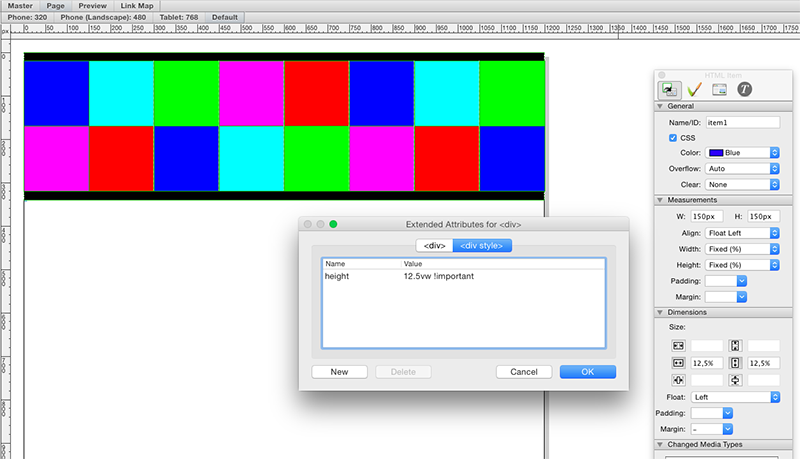
In a flexible width layout, just apply the proper % for width (12,5% in this 8-square example). Because squares tend to have the same height and width, you need to determine the height as well, but Freeway will use the percentage of the page-height, which -of course- is different. CSS3 However enables you to use the viewport as source (I’m currently using just two of them):

VW - Viewport Width (1=1%, 100=100%)
VH - Viewport Height (1=1%, 100=100%

Well, there you have it. But Freeway’s interface only supports %, px and em … you will have to apply those values using the extended feature. So having 12,5% applied for div width, you will need to open up the extended feature (Cmd+X) and select the DIV style tab. Now add a new attribute: ‘height’ for name and for value enter ‘12,5vw !important’ (without the quotes). Now you’ve just applied 12,5% of the viewport width to the DIV’s height. The !important part will overrule other height-attributes applied by Freeway. That’s all.

Demo found here:

http://demo.rvanheukelum.com/responsive-square-divs/


tutorials mailing list
email@hidden
Update your subscriptions at:
http://freewaytalk.net/person/options

Sorry, this should be : fwdemo.rvanheukelum.com/responsive-square-divs


tutorials mailing list
email@hidden
Update your subscriptions at:
http://freewaytalk.net/person/options

Just added some breakpoints to make sure possible content within these square div’s remain readable:

  • 768px and smaller : div’s 25% of viewport width
  • 480px and smaller : div’s 50% of viewport width
  • 320px and smaller : div’s 100% of viewport width

You will have to put this somewhere before :

<style type="text/css">

@media screen and (max-width:768px) {
#item1, #item2, #item3, #item4, #item5, #item6, #item7, #item8	{
		height: 25vw !important; 
		width: 25vw !important; 
	}
}

@media screen and (max-width:480px) {
#item1, #item2, #item3, #item4, #item5, #item6, #item7, #item8	{
		height: 50vw !important; 
		width: 50vw !important; 
	}
}

@media screen and (max-width:320px) {
#item1, #item2, #item3, #item4, #item5, #item6, #item7, #item8	{
		height: 100vw !important; 
		width: 100vw !important; 
	}
}

</style>

http://fwdemo.rvanheukelum.com/responsive-square-divs/


tutorials mailing list
email@hidden
Update your subscriptions at:
http://freewaytalk.net/person/options

Just added some breakpoints to make sure possible content within these
square div’s remain readable:
http://fwdemo.rvanheukelum.com/responsive-square-divs/

That’s brilliant, Richard. In case anyone’s wondering about browser
support, Can I use... Support tables for HTML5, CSS3, etc


tutorials mailing list
email@hidden
Update your subscriptions at:
http://freewaytalk.net/person/options

For the (possibly maximum of) 10% of users overall who can’t see this you can use padding to set the height of the squares;
http://www.freewayactions.com/test/responsive-square-divs/

Because padding is defined as a percentage of the parent width (in this case the page itself) we can use it to force the height of the object from 0px to match the width of the item.
http://www.w3.org/TR/CSS2/box.html#padding-properties
Strictly we’re not setting the height but the padding of the item but (certainly in this example) the effect should be the same plus the bonus that my old dev machine which runs OS X 10.6.8 can see the effect. :wink:
Regards,
Tim.

On 19 Nov 2014, at 17:10, Ernie Simpson wrote:

That’s brilliant, Richard. In case anyone’s wondering about browser
support, Can I use... Support tables for HTML5, CSS3, etc


FreewayActions.com - Freeware and commercial Actions for Freeway Express & Pro - http://www.freewayactions.com


tutorials mailing list
email@hidden
Update your subscriptions at:
http://freewaytalk.net/person/options

On 19 Nov 2014, 4:10 pm, The Big Erns wrote:

Just added some breakpoints to make sure possible content within these
square div’s remain readable:
http://fwdemo.rvanheukelum.com/responsive-square-divs/

That’s brilliant, Richard. In case anyone’s wondering about browser
support, Can I use... Support tables for HTML5, CSS3, etc

Tnx Ernie, nice to be able to give something back any now and then :wink:

Anyways … I already was playing with vw/vh values, hoping to trigger Softpress to start supporting it (used the same url you mentioned btw). I came across a couple of sites using square div’s, and I was looking for a way to keep them square while narrowing the width. In retrospect it is so easy … as usual :wink:


tutorials mailing list
email@hidden
Update your subscriptions at:
http://freewaytalk.net/person/options

On 19 Nov 2014, 4:50 pm, Tim Plumb wrote:

For the (possibly maximum of) 10% of users overall who can’t see this you can use padding to set the height of the squares;
http://www.freewayactions.com/test/responsive-square-divs/

Because padding is defined as a percentage of the parent width (in this case the page itself) we can use it to force the height of the object from 0px to match the width of the item.
Box model
Strictly we’re not setting the height but the padding of the item but (certainly in this example) the effect should be the same plus the bonus that my old dev machine which runs OS X 10.6.8 can see the effect. :wink:
Regards,
Tim

For as long as you don’t place variable text in it, or flexible items …


tutorials mailing list
email@hidden
Update your subscriptions at:
http://freewaytalk.net/person/options

For the (possibly maximum of) 10% of users overall who can’t see this you can use padding to set the height of the squares; http://www.freewayactions.com/test/responsive-square-divs/

Interestingly they aren’t square for me in Chrome 37 !?

D


tutorials mailing list
email@hidden
Update your subscriptions at:
http://freewaytalk.net/person/options

This wasn’t intended as an example of a solution that would work across the board. Chrome supports viewpoint units so is applying both the padding and the height to the items. The belt and braces approach would be to apply Modernizer to the page and fall back to using padding if the browser didn’t support viewpoint units.
Regards,
Tim.

On 19 Nov 2014, at 22:58, DeltaDave wrote:

Interestingly they aren’t square for me in Chrome 37 !?


FreewayActions.com - Freeware and commercial Actions for Freeway Express & Pro - http://www.freewayactions.com


tutorials mailing list
email@hidden
Update your subscriptions at:
http://freewaytalk.net/person/options

This wasn’t intended as an example of a solution that would work across the board.

I understand - thanks for the clarification.

D


tutorials mailing list
email@hidden
Update your subscriptions at:
http://freewaytalk.net/person/options