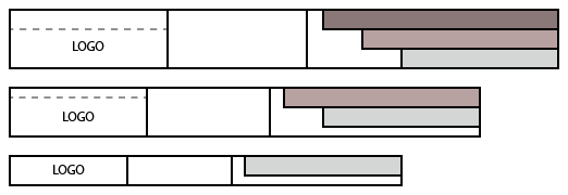
The above link is to a sketch of what I’m trying to achieve with a responsive header bar:
The logo is within an HTML object (passthrough) that is within another HTML object floated left. The logo is set to Fixed (%) vertically to work with the different heights of the parent object at the different breakpoints.
There are three vertically objects at the right, placed in an HTML object floated right. I need to reduce the number of objects from three down to one according to breakpoint.
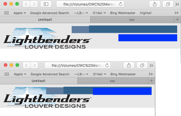
I’ve gone through all the tutorials, the documentation, etc., and have been working on the simple thing for a week and I’ve approached this from every angle I could think of, including having the three items placed manually, then repositioning and using the show checkbox for the items. The logo scales perfectly within Freeway and in Freeway everything works perfectly.
When viewed in a browser, however, the items with the “show” box unchecked are visible anyway and the logo is not resizing. I’ve been advised to set the logo to Fixed (%) horizontally, but when viewed on a wide monitor (such as my 27") and with the window manually resized horizontally, the logo shrinks to nothing (hence the vertical Fixed (%)).
Is there a way around the cascading responsive setup within Freeway? It works with basic stuff but not more complex layouts. If I could just set different content in the header bar at each breakpoint, I could have this done in five minutes and move on. I’ve been working on this very simple thing for days.
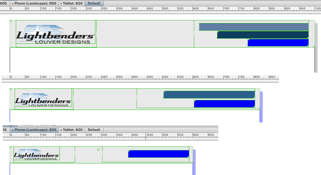
Trey, I hope that I’ve understood your sketches-- which I truly appreciate the effort on your part. I’ve made an example of what I think you are getting at:
I started to make a tutorial for everyone out of it as I think this is a good learning example of the benefits of the construction method the advanced Freeway users are using. Unfortunately, I am involved with other projects just now and cannot focus on finishing the tutorial. However, I’ve made the successful example available for download so that you and others can perhaps start getting your heads around it.
To recap, the file includes:
example of a successful way to achieve what (I think) you are trying to achieve
example of the best way to achieve flexible layouts in Freeway
example of how (and when) I use Freeway’s Responsive Workspace tools
example of how (and when) I use Freeway’s Responsive Style tools
example of the breakpoints I develop for (though you should notice that I don’t use them all, because a successful flexible layout makes it unnecessary to use them all
So sorry that my schedule doesn’t allow more time for exposition on how all this works-- maybe I can come back to this later, but it’s nothing new… If you want to make more than super basic web pages with Freeway, learn this construction method, learn how to take control of Freeway’s styles, expose yourself to the wild world of code.
