What the Action can do: This Action lets you do the following:
- It can create a feature-rich thumbnail gallery or slideshow which displays large versions of images inside a lightbox effect window on your page. There are literally thousands of different appearance options you can set up in your Showcase gallery.
Showcase lets anyone—even absolute beginners—effortlessly build a professional, feature-rich gallery or slideshow, and in a time they would never have thought possible.
Showcase works in two distinct stages—first you use the standalone Showcase application to create a gallery file, then you simply draw an Action item on your Freeway page and choose the saved gallery file in the Actions palette. Amazingly, you find flexibility and customization have not been compromised in any way by the application’s ease of use.
To show how quick and easy it is to build a gallery or slideshow with Showcase we’ll work through a basic step-by-step tutorial - after that you will almost certainly want to experiment with the myriad of options you have available to make your gallery or slideshow as unique as it is elegant and functional.
Before we start, decide which images you want to use for your gallery or slideshow. For the following step-by-step tutorial you will need 12 photos - so to make it quick and easy to find your photos, create a new folder on your Desktop and copy the 12 photos you want to use into there. Don’t worry about optimizing them, Showcase will do this for you.
Building a Photo Gallery
Note that Freeway Express AS and Freeway Pro AS customers (who downloaded Freeway from the App Store) will need to download the Showcase application from http://www.softpress.com/products/showcase.html. Customers who bought Freeway from the Softpress store will have Showcase in the download from the store.First thing you need to do is to launch the Showcase application.
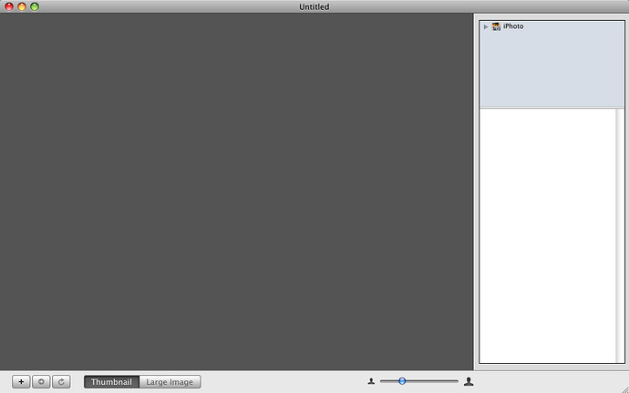
- Locate the application and double-click to launch it (or open it from the Dock if you also placed it there).This will present you with the Showcase application interface (see below). The various options are covered in the Reference section later, but for now we’ll simply use the default settings.
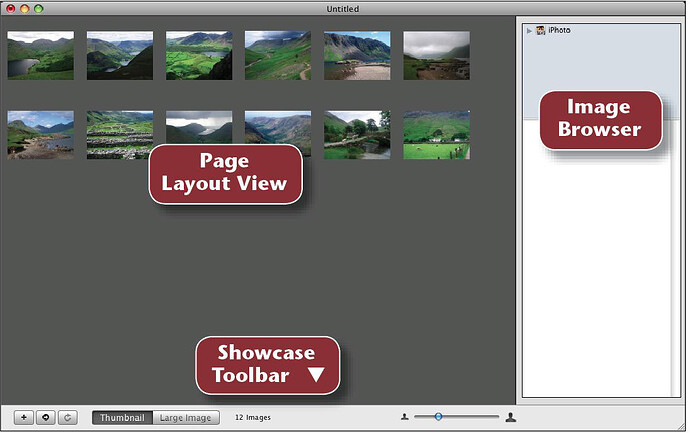
With the Showcase application window open, you now need to import the photos you want to use for the gallery. Showcase can import directly from iPhoto or Aperture (from the Image Browser in the top right), by dragging and dropping items from the Finder onto the Page Layout View pane of the application window or you can use the Plus (+) button on the bottom left of the Showcase window.
- Click on the Plus (+) button to display the Import Images dialog, navigate to the folder of images you created on your Desktop, select all the photos within the folder and click Open.
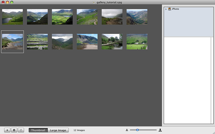
You will now see that the Page Layout View pane is populated with your imported photos. Note that below the Page Layout View pane the Thumbnail button is selected. If you click on the Large Image button (or double-click on a specific thumbnail image) you will see the default size used by Showcase to display the large image when a thumbnail is clicked on in the browser.
As we are only using the default settings in Showcase for this tutorial, you now simply need to save the selection of photos so they can be imported into Freeway and edited using the Showcase Action.
- Click on the Export to Freeway button (the second button from the left in the bottom left of the application window which displays a small, right-facing arrow).
- Choose a name and location for your Showcase file in the Export to Freeway dialog and click Save.
- Launch Freeway.
- Go to the Freeway menu (immediately to the right of the Apple menu), choose Preferences and switch on the Enable Applescript in Actions option.
- Create a new document of 900 pixels wide and 700 pixels high.
- Choose Center from the Inspector’s Align popup.
- Click on the Action tool on Freeway’s toolbar, choose Showcase then draw a large item on the page.
- If you don’t already have the Actions palette open, go to Window>Actions to open it.
- In the Actions palette, click on the Gallery File popup, choose Select..., locate the file you saved in the Showcase application and click Open.
- Click on the Theme popup and choose Steam.
- Open the Thumbnails panel of the Actions palette by clicking on the disclosure triangle.
- Enter 10px in the Padding field of the General panel and choose Center in the Thumb Alignment popup in the Layout panel.
- Resize the Action item using the handles to make it display the thumbnail gallery as four columns and three rows, then visually center it on your page.
When you move your mouse around, you’ll see that the thumbnails change color on mouseover.
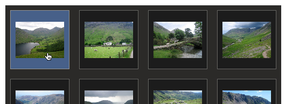
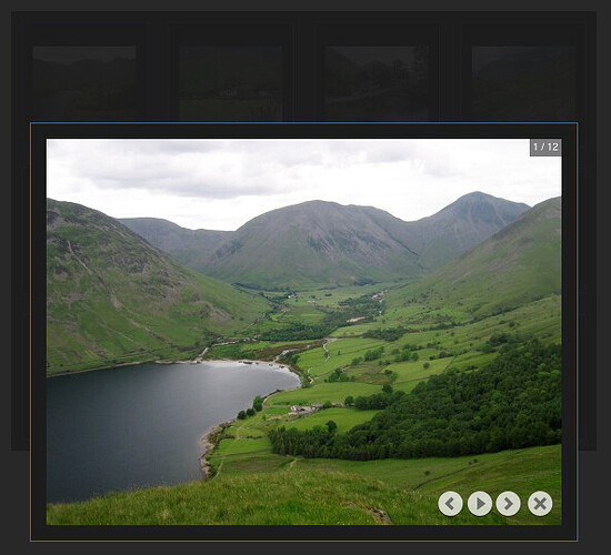
When a thumbnail is clicked, the page background dims and the large image of that thumbnail appears in the browser. Inset in the top right within the large image is a box to let the visitor know which photo in the set they currently have displayed) and a set of navigation buttons appears in the bottom right.
These buttons are, from left, Prev (previous), Play/Pause (clicking this triggers the display of all the images in a slideshow sequence), Next and Close (which returns the visitor to the thumbnail view). You can also view the previous and next large image by using the keyboard’s left and right arrows.
An elegant feature of the thumbnail gallery is that all of this works with a ‘genie effect’ on start or close and a fading transition between the large images.
In this brief tutorial you have seen that it has never been as quick or simple to create a thumbnail gallery. Although you only used the default settings and just one preset theme, the customization possibilities are almost limitless—with everything from using photo captions to adding shadows, reflections or rounded corners to images … and much more.
See the Showcase reference section later in this guide for full details of customization options.
Building a Slideshow
There is some crossover in functionality between the Showcase application and the Freeway Action, so it is possible to use the same Showcase gallery file created for the thumbnail gallery to build a slideshow.- Select the Action item, go to the Actions palette, click on the Type popup and choose Slideshow.
- Click on the Theme popup and choose Traditional.
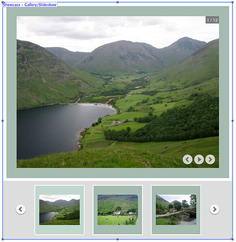
- Resize the Action item using the handles so it looks similar to the screenshot below and visual center it on the page.
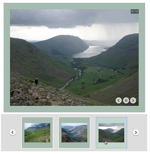
Now preview the page in a browser. The slideshow starts automatically when the page loads and you’ll see similar information inset within the large image to that displayed in the thumbnail gallery’s large image—with the exception of the Close button. Clicking on the keyboard’s left and right arrows manually changes the next or previous large image.
Below the large image is a row of thumbnails with Previous and Next buttons to slide the previous or next selection of thumbnails into view. The amount of thumbnails displayed in this row and whether they appear above, below, left or right of the large image (or with no thumbnails at all) is controlled by settings in the Actions palette.
If you click on a thumbnail in a browser, the slideshow will jump to the large version of that image and will resume the slideshow from that point.
Now that you know how to create a Showcase thumbnail gallery or slideshow, we hope you are inspired to experiment with the settings to design your own custom gallery. You choose the images and display options, and let the Showcase application and Freeway’s Showcase Action do all the work.
Although simple to implement, the galleries and slideshows produced are fully W3C-compliant and, because they use CSS, they are quick to load, quick to run and look fantastic in any modern browser.
A reference section, which explains all the settings in the Showcase application and the Showcase Action, appears later in this guide.
Note: You can save your Showcase application file to make edits later. In the Showcase application, go to File>Save, choose a name and location and click Save. This will save a file with a suffix of “.spg” to your hard disk.
Note also: The Showcase gallery file created when you use the Export to Freeway function has a suffix of “.fwgallery”.
Showcase Application Reference Section
The Document Window
There are two main parts to the Showcase application—the document window and the Inspector. First we’ll look at the document window.Page Layout View
Unless you open an existing Showcase application file, the dark grey panel called the Picture Viewer will be empty. This is where you drag and drop, go to File>Import or use the button to import the images you want to use for the gallery or slideshow. By default this displays in thumbnail view.Images are displayed in alphabetical/numerical order, and it is important to note that this is the order they will appear in the sequence of your thumbnail gallery or slideshow. The order of your images can be changed by dragging an image into a new location. When you drag an image you will see a blue insertion point line appear where the image will be placed when you release the mouse button.
If images are already in the Picture Viewer, dragging and dropping additional images will display the blue insertion line in the current order of photos.
To delete an image in the Picture Viewer, select it and hit the Delete key or go to Edit>Delete.
To make multiple selections in the Picture Viewer, Command-click to add additional single images. Clicking on one image then Shift-clicking on another will select both images plus all images in between. You can also select an image, hold down the Shift key and use the arrow keys on the keyboard to add adjacent images to the selection.
It is also possible to draw a selection marquee by clicking on a blank area of the Picture Viewer and dragging over multiple images.
A maximum of 200 images that can be held in the Picture Viewer. If more are added, only those taking the number up to the limit (in alphabetical/numerical order) will be imported but there will be no warning that the limit is exceeded.
The Picture Viewer supports the import of JPEG, PNG, TIFF, Photoshop (.psd) and PDF file formats.
The import function allows you to drag and drop a folder into the Picture Viewer to import the entire contents. Note, however, that this will also import the contents of any sub-folders within that folder.
The Image Browser
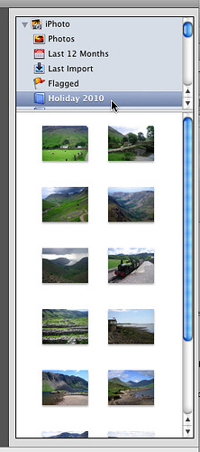
The Showcase application offers a dedicated panel in its interface to display iPhoto and Aperture galleries if these applications are installed on your computer.
Click on the disclosure triangle by the name of the application you want to import from to display your preset galleries and then drag and drop individual images or multiple selections into the Picture Viewer panel.
The same multiple selection techniques used in the Picture Viewer can also be used in the iPhoto/Aperture panel.
Note that you cannot drag and drop an album into the Picture Viewer—if you want to import all the photos from an album you need to select one item in the album and then go to Edit>Select All or use the keyboard shortcut of Command-a and then drag and drop all the selected items.
The Showcase toolbar
The common tools used in the Showcase application are all easily available on the toolbar at the foot of the application interface. Here we’ll cover each item on the toolbar in turn from left to right.
The ![]() button: Click on this to import images into the Picture Viewer through the Import Images dialog.
button: Click on this to import images into the Picture Viewer through the Import Images dialog.
The ![]() button: Click on this to save your Showcase gallery file through the Export to Freeway dialog.
button: Click on this to save your Showcase gallery file through the Export to Freeway dialog.
The ![]() button: Click on this to refresh the current set of thumbnails if, for instance, an image has been changed or a missing image has been found.
button: Click on this to refresh the current set of thumbnails if, for instance, an image has been changed or a missing image has been found.
The Thumbnail/Large Image buttons: By default the Showcase application will display the Picture Viewer in thumbnail view. Clicking on the appropriate button will toggle the view between the thumbnails and large images you will use when you save your gallery file or export to Freeway.
The Showcase status text: If there are no images in the Picture Viewer, the area between the Thumbnail/Large Image buttons and the slider will be blank. When images have been imported, this will display the number of images currently in the Picture Viewer, and will also warn of any pictures with “missing” link status.
The Image Size Slider: The Showcase application will save the thumbnails and large images at the sizes chosen in the Picture Viewer when you export the gallery file.
The default sizes of images in the Picture Viewer are 100 pixels for thumbnails and 500 pixels for large images. These sizes relate to the square “cell” containing the image so that when the gallery is viewed in a browser the background of the whole cell will change color on mouseover.
The Inspector
The Showcase application’s Inspector palette should display by default—if you don’t see it, go to the View menu and choose Inspector.The Inspector is very similar to the one used in Freeway itself, and it has three “tabs” at the top to choose specific functionality in logical groups, so each tab displays very different settings. The three tabs are General, Appearance and Output.
It is important to note that some of the settings applied to a thumbnail gallery or slideshow in the Showcase application can be overridden later in the Showcase Action in Freeway. The specific settings which must be applied in the Showcase application’s Inspector are:
- The size of the thumbnails and large images;
- Borders on images (rather than cells);
- Reflections or shadows on images;
- Rounded corners on images;
- Caption information for the images.
The General tab
As the name suggests, this tab is where you can apply the main settings of how the thumbnail gallery or slideshow is structured when you export to Freeway.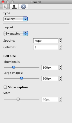
TYPE: This popup has options for Gallery or Slideshow. This will not affect the display of images in the Picture Viewer, but it determines the default view when imported into Freeway’s Showcase Action.
LAYOUT: The options in this panel are different, depending on whether Gallery or Slideshow is chosen in the Type popup. Using Gallery there is a choice to arrange the layout by spacing or columns. By Spacing specifies that the thumbnails are positioned within a grid using a set pixel width between each thumbnail.
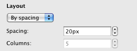
When imported into Freeway, By Spacing means that the thumbnails will flow inline within the Showcase Action item and they will turn when there is not enough space for one more thumbnail on that line. Using By Columns fixes the position of thumbnails so they won’t reflow if the Showcase item in Freeway is made wider or narrower. By Columns specifies that the thumbnails should be arranged in a set number of columns.
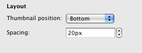
Using Slideshow for Type a popup is displayed to specify the position of where the thumbnails will appear in relation to the large slideshow image. The options in here are Bottom, Right, Top or Left.
CELL SIZE: The sliders for Thumbnails and Large images in this panel do the same as the sliders in the respective views on the Showcase application toolbar. If you prefer, you can enter precise values in the size fields to the right of the sliders.
Clicking on the Show caption checkbox displays dummy text below the thumbnails in the Picture Viewer. Clicking on this text allows you to enter your own text to use as image captions for each image. This must be used in thumbnail view and, although the Picture Viewer won’t display the caption when the large image is displayed, the caption will appear below the large image when the gallery file is used in Freeway.
The Size slider below the Show caption checkbox determines the height of the caption area within the thumbnail’s cell.
The Appearance tab
This tab is where you apply attributes which affect the appearance of the images in the Picture Viewer.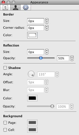
BORDER: The Size value determines the thickness of the rule around the image (rather than the cell). This value extends outside of the image area, so increasing the border value makes the image size smaller within the cell. This will only affect the thumbnails (not the large images). The Corner radius value determines the size of rounded corners applied to the image. This only affects thumbnails (not large images). Click on the Color button to display the color picker to choose a color for your thumbnail borders.
REFLECTION: Using the specific value in the Size field increases the vertical size of the automatically-generated reflection image below the thumbnail. This only affects thumbnails (not large images). Using the Opacity slider you can adjust the opacity (transparency) of the reflection image.
SHADOW: Switch on the checkbox to the left of Shadow to apply a shadow effect to your images. This only affects thumbnails (not large images). Angle is the value in degrees in which the shadow is cast from the image. Offset is the distance in pixels that the shadow is offset from the thumbnail itself. Blur is the blur radius of the shadow in pixels. Click on the Color button to display the color picker to choose a color for your shadow effect. Opacity sets the value for opacity (transparency) of the shadow.
BACKGROUND: Switch on the either or both checkboxes to apply colors to Page (the background color of the gallery or slideshow) or Cell (the background color of the thumbnail’s container cell—this only affects thumbnails, not large images).
The Output tab
The settings in this tab control settings for how the images will be output for use on the web.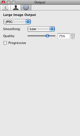
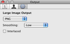
LARGE IMAGE OUTPUT: The Showcase application will always output your thumbnails as PNG files—this is so that applied shadow and reflection effects work properly. However, you can control how your large images are output. Click on the Large Image Output popup to choose between JPEG or PNG. Note that choosing PNG will usually result in a better quality image, but it will increase the size of the images slightly which may affect the loading speed of the gallery/slideshow when viewed in a browser. Click on the Smoothing popup to control the amount of smoothing applied to your large images.
Showcase Action Reference Section
To use a gallery file exported from the Showcase application on your Freeway page, you need to click on the Action tool on Freeway’s toolbar, choose Showcase and then draw an item on your page. If you don’t see the Actions palette, open it by going to Window>Actions.The Showcase Action palette
There are just a few options available in the default Action palette.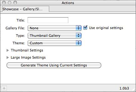
The Title field lets you apply a title “tag” for the thumbnail gallery or slideshow item on your page so that hovering a mouse over the background of the item on the page in a browser displays the name you enter for the item’s title.
Clicking on the Gallery File popup you can import the gallery file you exported to Freeway in the Showcase application. Choose Select..., locate the gallery file and click Open. As soon as you open a gallery file, the Showcase Action item will display the thumbnail gallery or slideshow in whichever format you chose in the Type popup of the Showcase application’s Inspector. If you didn’t choose a specific type, the item will display the images in the default Thumbnail Gallery mode.
The Use original settings checkbox is checked by default. If you make any changes to the Gallery File, Type or Theme popups (or apply any settings in the Thumbnail Settings or Large Image Settings panels) the checkbox will be unchecked. Checking it again will revert the gallery file back to the defaults of the file as it was exported from the Showcase application.
Clicking on the Type popup to choose Thumbnail Gallery or Slideshow will override any choice made in the Showcase application’s Type popup. If you made a specific choice in the Showcase application, this will be set by default in the Actions palette.
Showcase lets you choose from a set of attractive themes to quickly apply predetermined background colors, borders, padding settings, etc. Click on the Theme popup to choose one.
You can edit a preset theme to personalize it to your liking. If you do this, the Theme popup will display as Custom to show that it’s been edited.
The Thumbnail Settings and Large Image Settings panels (click on the appropriate disclosure triangle to view) will be covered later.
The Generate Theme from Current Settings button lets you save your favorite settings as a custom theme so you can easily apply it to any thumbnail gallery or slideshow in the future.
To save a custom theme, apply your settings, click on the button to open the Save dialog, give a name to your theme, choose a location and click Save. This will save a file to your hard disk which you can then open by clicking on the Theme popup, choosing Select... to open the Select a theme dialog, locating your saved theme file and clicking Open.
The Thumbnail Settings panel
Clicking on the disclosure triangle next to Thumbnail Settings opens a new panel in the Actions palette.Many settings for both Thumbnail and Large Image panels are identical, so we’ll refer back to these in the Large Image Settings panel section.
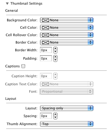
GENERAL: The Background Color popup controls the color used for the background of the Showcase Action item itself.
The Cell Color popup applies to the “normal” state of an image cell, whereas the Cell Rollover Color applied to the image cell when moused over in a browser.
If a color is applied in the Border Color popup, the Border Width and Padding values will take effect on the images in the Action item—adding a cell border and space within the cell border respectively. If no border color is set, these won’t do anything. Note that using border width or padding values will add to the cell’s size in relation to the value used.
CAPTIONS: This panel will be greyed out until the Captions option is checked. If you want to have captions on the images in your gallery or slideshow, this needs to be done in the Showcase application before exporting the file to Freeway. Checking this option in the Action palette if you don’t have captions will simply result in a large space being added below the image in the image cell.
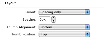
LAYOUT: Just like in the Showcase application, there is an option to choose between two different types of layout for your thumbnail images. This is done by clicking on the Layout popup.
By Spacing and Columns specifies that the thumbnails should be arranged in a set number of columns and you can specify the horizontal spacing between each column of images.
If you choose By Spacing the thumbnails will flow inline within the Showcase Action item and they will turn when there is not enough space for one more thumbnail on that line. Using By Spacing and Columns fixes the position of thumbnails so they won’t reflow if the Showcase item in Freeway is made wider or narrower.
If you have portrait and landscape images in your gallery or slideshow, you can control how they align in the grid of thumbnails. Click the Thumb Alignment popup and choose from Top, Center or Bottom.
If you have Slideshow selected in the Type popup in the top panel of the Inspector, you will see an extra popup called Thumb Position. This controls where the row of thumbnails will be positioned in relation to the large image. You can choose from Bottom, Right, Top, Left or None. Choosing None will create a slideshow with no thumbnails.
The Large Image Settings panel
As stated earlier, many settings in the Large Image Settings panel are identical to those in the Thumbnail Settings panel—so if you don’t see a specific mention of an option here, check the Thumbnail Settings panel section if you need information on that option.GENERAL
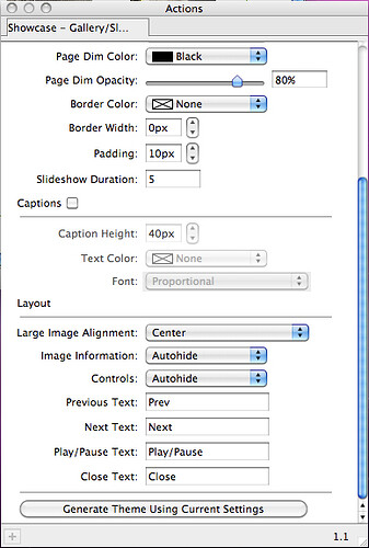
When a thumbnail is clicked on in a browser, you will see the page background dim when the large image is displayed and this can be controlled in the General panel.
The Page Dim Color popup lets you select a color for the dimmed background and the Page Dim Opacity slider lets you choose the amount of opacity (transparency) used on the dimmed background so you can see more or less of the thumbnail images (and other content on the page) on the original page.
The Slideshow Duration value controls the time (in seconds) before the next image appears. This value applies to slideshows as well as thumbnail images when the Play/Pause button is clicked on to start the slideshow sequence.
LAYOUT: The Large Image Alignment aligns the large image within its container in a slideshow (so you can, for instance, make sure the images are always in the same place). Choose from Top, Center or Bottom.
The next four options in the Layout panel control the “tooltip” text displayed when the Control buttons are hovered over. The Previous Text, Next Text, Play/Pause Text and Close Text fields allow you to change the default display by entering the wording (or language) you want.
