I have embedded 2 iframes in my site, one a Soundcloud page and the other a Vimeo page. Inserting an iFrame in a box in Xway works beautifully, except that I can’t seem to configure the windows in such a way that they will resize for smaller screens. Any suggestions?
If you’re using Xway’s iframe object you can simply set the width and height of the item to whatever you like, including percentage values. If you’re adding entire iframe code lumps (such as what Vimeo gives you) I suggest copying the URL itself from there and using that in an Xway-made iframe.
Thanks for the reply. I am using the embed codes from both platforms. The issue is a formatting one; Without setting dimensions, the boxes appear quite small, too small for the webpage if viewed on a computer, or even a tablet. If I set the dimensions, or even the minimum dimensions, the iframe doesn’t resize for a cellphone, and runs off the screen. It is possible to pinch to resize on the cellphone, but this causes it’s own problems with the windows.
I was hoping for a setting or way fo managing embedded media in Xway that would allow for better resizing on the small screen.
I was a long time Freeway user and just come back to XWAY after using Muse and then dabbling with Dreamweaver. I’m enjoying the interface and workflow and have created 2 websites since Friday.
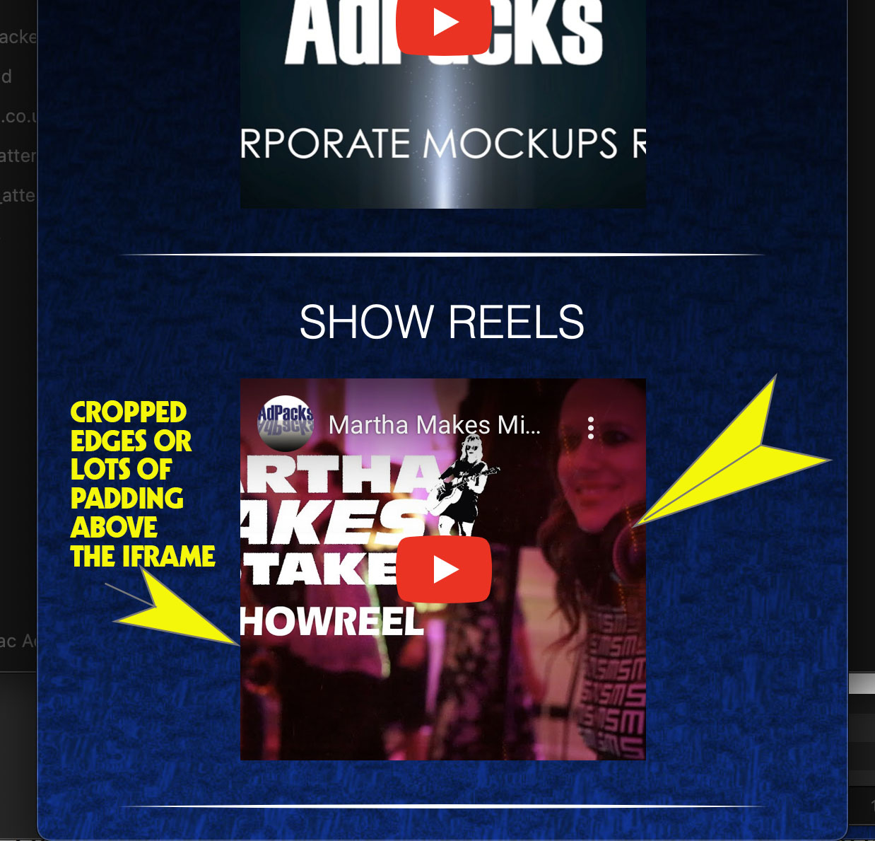
So the reason to revive this topic. I have the same issue as John13 and followed the instructions in the manual. Worked perfectly but I wanted the iFrames to be a percentage of the page width not the full width.
I had the idea of reducing the width of the container box to 80% and then having the padding 80% of the 56.5 so 40.5% and scaling the iFrame. this worked but had to reduce the size of the iframe to 80%. However the iFrame was now partiallly cropped and ranged left. A combination of changing the iFrame size to 768 pixels wide plus different padding and margin options gave me an uncropped centred iFrame however it did not resize properly on the live web page.
So using your method how can I have an iFrame that stays at approx 80% of the page width and centred when scaled for different screens without cropping the sides off the iFrame or having a huge amount of top padding? I currently have the website live with the iFrames cropping when the page is resized as this is preferable to big gaps.
Many thanks and love the app. Can’t wait for the commercial version and just upgraded to Exhibeo 2 .
That’s an interesting question, and the reason the iframe is getting cropped is because the padding trick assumes that the parent box (the div wrapper) is the full width of its parent.
The simplest way to deal with this would be to put the div wrapper inside a second (outer) wrapper, and set the 80% width on that wrapper. This avoids having to calculate a new value for bottom padding, and should continue working if you later change the width of the outer wrapper to a different value, or add some padding.
In. Xway:
Insert a container box after the wrapper containing the iframe
Select the wrapper containing the iframe
Cut and paste it into the new wrapper (the container box you just inserted)
Thanks for this Jeremy. I was playing with the settings when you go and release Beta version 0. 7 and you have gone an added flex containers that just work. Brilliant.
Just about to upload my revised website using XWAY 0.7.