Thanks Karen… but I think the template Richard provided will work out much better when I understand the few aspects that are puzzling.
Ann
freewaytalk mailing list
email@hidden
Update your subscriptions at:
Thanks Karen… but I think the template Richard provided will work out much better when I understand the few aspects that are puzzling.
Ann
freewaytalk mailing list
email@hidden
Update your subscriptions at:
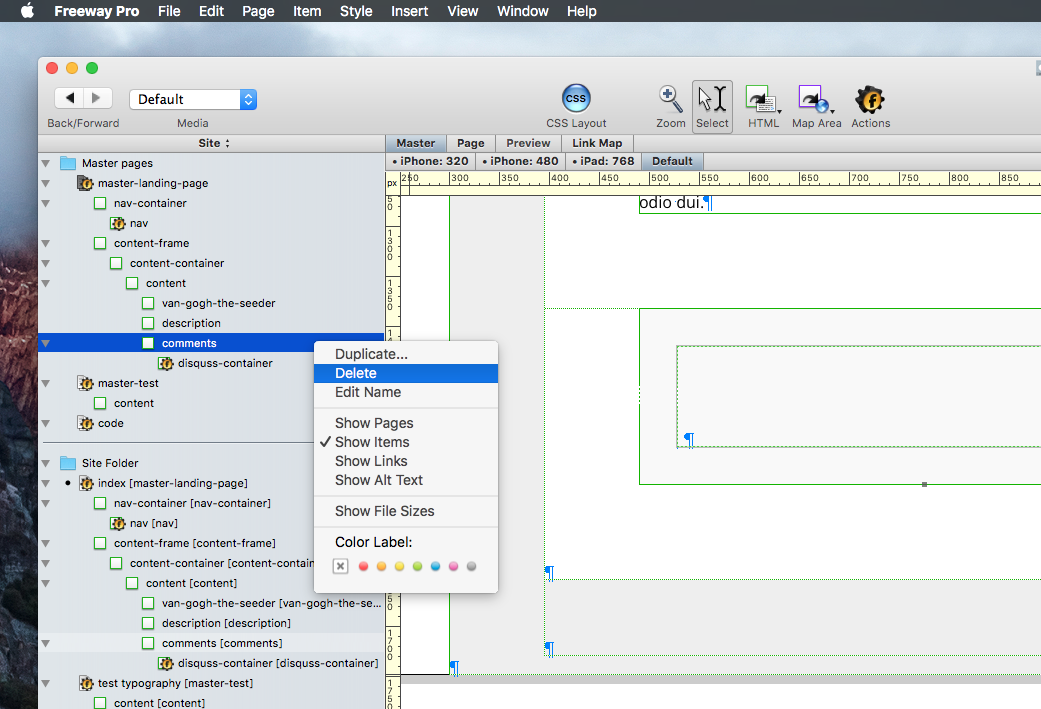
Disqus
Disqus is a way for visitors to place comments. You might or might not be interested in such a feature. Nevertheless, removing this from the document is easy … select it and delete it. Done.
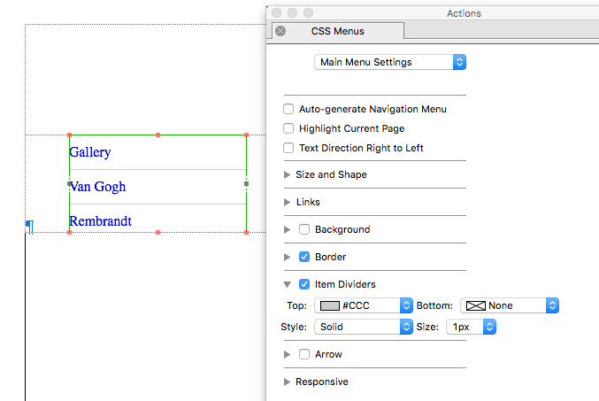
Navigation
Removing the lines (the item dividers) from the menu is easy. The menu is build via the CSS Menu action, so select the menu and go to your Action palette. There’s a setting called ‘Item Dividers’ … turn it off. Done.
 .
.
Do you want to get rid of the lines on the top and bottom of the menu as well? Turn off ‘Border’.
Please let me know when I can help you with anything else. ![]()
Richard
freewaytalk mailing list
email@hidden
Update your subscriptions at:
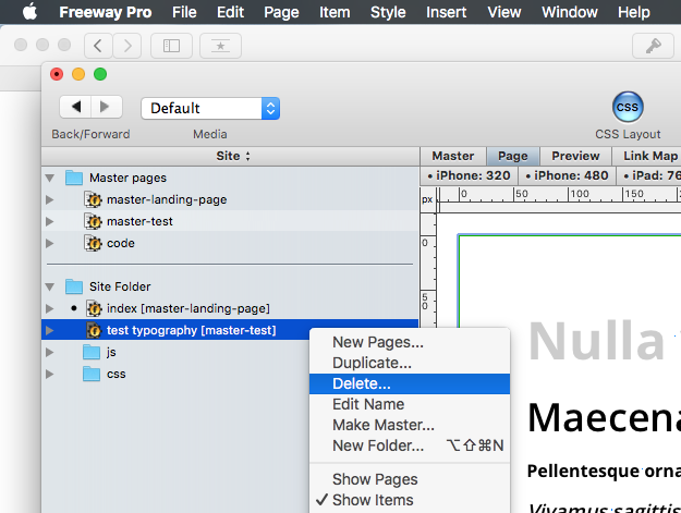
Oh Ann, by the way … you can delete the page ‘test typography’ as well. It was just there for you to see how the custom fonts & styles work out …
Richard
freewaytalk mailing list
email@hidden
Update your subscriptions at:
Thanks… Got most done except the 3 tiny bars for site page clicks. Keeping them means 2 actions are needed to go to a different page. Instead it is preferable to see the page names to navigate the site. Current spacing between the page names can be reduced. I searched the template without finding how to alter these items.
ONLINE I see difference results in FF and Safari AFTER FTP upload
in Safari is shows a blue scroll bar alongside the entire text on the Shevelea page… In FireFox it is NOT there; and it’s not there in the saved FWPro file.
Also online FF shows intermittent black segments at some widths They do not exist in the actual file. These may be querks of browsers?
freewaytalk mailing list
email@hidden
Update your subscriptions at:
According the 3 tiny bars; it is just the hamburger image that is used to open up the responsive menu on mobile view. That images is selected via the actions palette:
The space between the ‘names’ within the menu can be altered via (again) the actions palette. You can alter the padding of the menu items in order to bring them closer to each other.
But I won’t do that if I were you. Remember that YOU might not be comfortable with the usage of a hamburger for responsive/mobile view, but truth is … ‘so what’? You’re not building this for yourself, but in order to reach an audience, and that audience, using their phones and tablets are well aware of and well used to hamburger icons for opening menu’s on mobile devices. So, ask yourself … do you really want to dump a load of tidy, hardly readable menu-items which are cramped into each other on your mobile public, because you don’t like a hamburger icon?
Or … give them a pleasant looking page … with that one recognisable icon that opens up the navigation?
Think about it,
Richard
freewaytalk mailing list
email@hidden
Update your subscriptions at:
Please don’t use GIF-text, they look awful and there not SEO friendly.
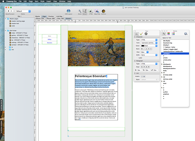
You might want to re-think your styles as well … 20px semibold text for content is pretty much ‘in your face’. The font set for ‘body’ is a 16px regular and has a nice line-height which makes it easy to read.
You don’t need all these extra styles, just select and apply ‘b’ whenever you want same text bold, ‘i’ whenever you need it to be italic. It’s laid out pretty straight forward.
Richard
freewaytalk mailing list
email@hidden
Update your subscriptions at:
Thanks, will re check text. thought I used your text font.
on the page. On the hamberger items. Strange that two actions are more beneficial than one (click once to view,click #2 to go to a page)
Seems a waste of time/energy. Thanks for the overview
On gallery page need extra container for more html text. My efforts have failed- when I inserted via the site panel. Instead of going below the existing item “content” in Gallery, it ends up below “comments” and at a higher level (further left position in site window. Need solution.
Also, in Safari on both macs (with different versions) the ftp upload shows an item on the Sheveleva page that is NOT there in the template file in FW Pro 7.1.1. Several uploads still leave it there, but NOT in Fire Fox!!! It looks like a up/down blue scroll bar.
Can you suggest what it needed to adjust that?
Thank you for your patience
Ann
freewaytalk mailing list
email@hidden
Update your subscriptions at:
On gallery page need extra container for more html text. My efforts have failed- when I inserted via the site panel. Instead of going below the existing item “content” in Gallery, it ends up below “comments” and at a higher level (further left position in site window. Need solution.
On the FW page select the html container after which you want your NEW container to appear.
Use the Right Arrow key on the Keyboard to move the cursor/insertion point after the current container. Now use Insert>Html Item to insert a new container.
David
freewaytalk mailing list
email@hidden
Update your subscriptions at:
https://freewaytalk.softpress.com/person/options
It looks like a up/down blue scroll bar. Can you suggest what it needed to adjust that?
Try reducing the text size on that section - does that remove it?
If so then I suspect that your container does not have a flexible height.
Your text is a bit on the large size at 20px anyway!
D
freewaytalk mailing list
email@hidden
Update your subscriptions at:
https://freewaytalk.softpress.com/person/options
Also, in Safari on both macs (with different versions) the ftp upload shows an item on the Sheveleva page that is NOT there in the template file in FW Pro 7.1.1.
I think it IS there and is called “comments”. Either delete it, or set its background-color to white.
The inner scroll thing is a bit curious - but I suppose it has to do with overflow (which is auto). I am not convinced 100% of defined heights by viewport units. Run into some Safari troubles in the past by this.
And apologize Ann - should have been aware of your situation cause you already told me in the past. Just forgot about.
Cheers
Thomas
freewaytalk mailing list
email@hidden
Update your subscriptions at:
https://freewaytalk.softpress.com/person/options
This apparently isn’t my good night. Tried to post twice and it said I had to reconnect. Here’s 3rd effort.
Thanks for the responses. I make the container and verified flexible does exist.
In the work I did subsequently FWPro froze up 3 times and had to force quit. Now material that gets uploaded to the site differs from what is in my original. If you want to see the result look at the KA page or the Sheveleva Page where two different text sizes appear in an HTML container. Here the are all the same size and type. I cured the strange vertical blue line on the Sheveleva page but I NOW suspect FWpro needs reinstalling. The zip file for 7.1.1 is in the DMG folder.
What precautions or odd steps should be taken to overwrite and replace FWPro… it’s been sooo long since I had to overwrite a program. Help!
Ann http://www.alessandrajouberteix.com/sheveleva.html
freewaytalk mailing list
email@hidden
Update your subscriptions at:
For the love of Oprah. I just posted a reply of about a mile long; now it doesn’t show up …
freewaytalk mailing list
email@hidden
Update your subscriptions at:
THIRD ATTEMPT TO SUBMIT POST
On 13 Sep 2015, 8:02 pm, Ann Amber wrote:
Thanks, will re check text. thought I used your text font.
Just don’t style it via the inspector, all styles are already available via the styles palette. That was where the typography page was for; for you to see how all styles work out.
The template is quite easy to work with; you just need to create the desired pages from the master, replace the dummy header images and the Lorem Ipsum texts, that’s all:
on the page. On the hamberger items. Strange that two actions are more beneficial than one (click once to view,click #2 to go to a page). > Seems a waste of time/energy. Thanks for the overview.
The usage of the hamburger icon is a common and respected standard for mobile views. It just doesn’t make sense to fill up (at least) half of your mobile screen with the same menu every page, while you could see the content. Therefore the menu is ‘hidden’ behind the icon, it will appear as soon as you call for it.
On gallery page need extra container for more html text. My efforts have failed- when I inserted via the site panel. Instead of going below the existing item “content” in Gallery, it ends up below “comments” and at a higher level (further left position in site window. Need solution.
You already have a container called ‘description’ right below the header image. You could quote the whole quran and still it will expand. It’s a flexible div.
Also, in Safari on both macs (with different versions) the ftp upload shows an item on the Sheveleva page that is NOT there in the template file in FW Pro 7.1.1. Several uploads still leave it there, but NOT in Fire Fox!!! It looks like a up/down blue scroll bar.
Can you suggest what it needed to adjust that?
Just checked your efforts in Firefox, and I don’t see whatever it is you’re seeing here, sorry.
However, I’ve uploaded my files to make it possible for you (all) to compare them with the pages you’ve uploaded:
Perhaps you’re more comfortable just swapping the header image and text, so I’ve uploaded an updated file for you to work with. It already has the pages present and linked in the menu.
Here is an updated file for you to work with …
Swap header image
Swap texts
A few notes though:
freewaytalk mailing list
email@hidden
Update your subscriptions at:
https://freewaytalk.softpress.com/person/options
I believe reinstalling FW Pro is the most important step FIRST from
a zip file for 7.1.1 is in the DMG folder.
What precautions or odd steps should be taken to overwrite and replace FWPro…
freewaytalk mailing list
email@hidden
Update your subscriptions at:
None. Just drag & dop … it’ll overwrite the app, NOT the settings.
freewaytalk mailing list
email@hidden
Update your subscriptions at:
Thanks!
freewaytalk mailing list
email@hidden
Update your subscriptions at:
Richard… Having a problem getting text to function properly in the Content Containers created with the template. The online font is always larger that what I specify. Totally unable to get it to size I specify. What’s inherent to that container? Is it FWP misfunctioning?
Or? Please Look online at the gallery, Sheveleva, Ka pages to see the results.
Ann
freewaytalk mailing list
email@hidden
Update your subscriptions at:
Richard. I suspect the obvious difference occurring with text placed in different items is CSS connected. In comparing INSPECTOR pallets I saw two different layouts of “CSS” in the inspector pallets with other different settings; which I suspect is a clue to the ‘box’ construction.
Found an article from several years back on Box in FW 5 and just got an item " CSS Layout (Inline Box Model) in Freeway 6" in hopes it will aid understanding the template.
Any other guidesl may help. Also will review your info in “THIRD ATTEMPT TO SUBMIT POST.” post above.
Thanks for the patience
Ann
freewaytalk mailing list
email@hidden
Update your subscriptions at:
On 15 Sep 2015, 5:07 am, Ann Amber wrote:
Also will review your info in “THIRD ATTEMPT TO SUBMIT POST.” post above.
yeah, I probably experienced the same issues you had trying to submit a post here … after submitting nothing happened and I had to start over again ![]()
freewaytalk mailing list
email@hidden
Update your subscriptions at:
https://freewaytalk.softpress.com/person/options
On 15 Sep 2015, 5:07 am, Ann Amber wrote:
Richard. I suspect the obvious difference occurring with text placed in different items is CSS connected. In comparing INSPECTOR pallets I saw two different layouts of “CSS” in the inspector pallets with other different settings; which I suspect is a clue to the ‘box’ construction.
Yes, it is an inline box model layout as mentioned in a post September 11th.
Found an article from several years back on Box in FW 5 and just got an item " CSS Layout (Inline Box Model) in Freeway 6" in hopes it will aid understanding the template.
Any other guidesl may help.
Well, you could start with reading the ‘Get the Intro to Responsive guide’.
Best regards, Richard
freewaytalk mailing list
email@hidden
Update your subscriptions at:
https://freewaytalk.softpress.com/person/options