It was (just) the slider that was created in AmazingSlider, the site itself was completely constructed in Freeway7. Online it only shows a frontpage with some dead links, but the complete project was started and finished with Freeway7.
At the end, the client (an inexperienced Freeway user) didn’t feel confident enough to use it, and had it recreated in WordPress where he did feel confident enough about.
Such a slider/slideshow can be inserted in a site like the one we’re trying to finish without any issues.
But … I expect the same hesitation on your behalf as well. The template, even in it’s simplicity, already drives you nuts sometimes, while it barely holds anything. The inline construction is something a lot of Freeway users are hesitant or even reluctant about. I understand that, but believe me that the learning curve really ain’t that difficult. But you’ll need to change perspective. It’s a different mind-set.
Next to that, you’ll have to ‘learn to use’ AmazingSlider in order to create a slider. Same goes for Exhibeo in case you’ll choose to use that one (which is in fact cheaper). Anyway … it’s another thing you’ll have to face.
Richard
freewaytalk mailing list
email@hidden
Update your subscriptions at:
Thanks D… I attempted it after your post and found It doesn’t work the way I think it may… So found the 250 page FW Reference(small.pdf) so will study Actions; intro to responsive design; padding and margins as there is obviously something I need to understand.
freewaytalk mailing list
email@hidden
Update your subscriptions at:
http://alessandrajouberteix.com/
NOW shows the way she wants the layout - like the existing template with image, and text on each page up to 25 or so.
There’s a white margin on top of the image that shouldn’t be there (caused by one and sometimes 2 paragraphs)
The image has a fixed with (not responsive anymore)
The div’s lost their padding
The div’s no longer match with the master div’s
Texts have unnecessary text-styles (for example you’ve applied a open sans-semibold to a paragraph, and added ‘bold’ to it. So now text is a bold semi-bold.
The menu has drifted to the left, it’s no longer centered in the white area
The images are not properly cropped.
You’ve not used the available valid styles that already are present in the styles palette for bold and italic (b and i)
The overall design might match the look Alessandra might agree with (and matches my original template), but it’s a mess. Remember; only the dummy image and the dummy text had to be replaced, but now it looks like a bom has gone off and all styling has been thrown out the window.
There was a typography test page available, showing what styles were available and how they looked, but apparently it wasn’t used. Div’s were deleted and replaced by new ones that were supposed to match the deleted ones, but fail. The div ‘content’ parented 2 child div’s; one containing the responsive image, the other one the text. It couldn’t be more simple than that. I really think you should return to that and certainly don’t use ‘justified’ for alignment. It causes horrible spacing and it looks terrible when switching to mobile.
As was posted September 14th:
Swap header image
Select dummy image
Hit Cmd+B to delete content
Hit Cmd+E to import new content
Browse to Select your properly cropped header image
Check ‘Pass through’ and proceed
In the inspector change width (back to) ‘fixed (%)’
Swap texts
Select Dummy text
Set style to ‘none’ via the styles palette
Copy and paste new text into the container
Style it appropriately with H2, prologue, b (for bold), i (for italic), etc.
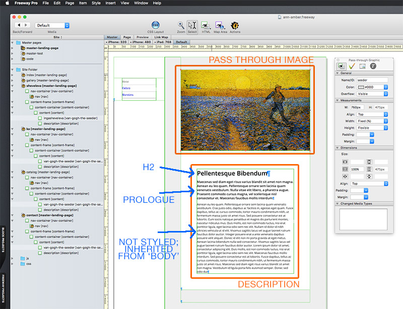
As was posted September 16th:
- content (DIV)
  - pass through image (100% width, fixed (%), flexible height
  - description (DIV, this is where the text goes)
The styles already are present in the styles palette, you can edit these within the styles editor.
D the file I found for study is dated 9/5/15. It did not exist here in my world prior to that.
my apologies Richard; but we both seem to be using words/phrases that are not communicatIng. In my non-imagery world I have to take items and try them to find out what happens; so to understand the effect of margins and padding is to change it and see what happens. And sometimes that creates problems I admit, but it’s my learning process and I’ve not done it enough to have a clear understanding of it yet.
My way of life has always been ‘could it be’ or ‘what if’ or ‘lets try this’ … and so on, and rarely ‘by the book’ …even on day to day chores like installing a replacement bag on the carpet vacuum.
So when an image or container isn’t functioning in a way I want it to, I experiment with no idea of the consequences and often have had to restart a project… yet out of that have come some ‘new’ aspects that are ‘better’ than what’s available up to then.
Likely that’s not happening in the highly critical code that I will never understand… and it’s a risk I have to take to learn to do it my way…not egotistical, but what ‘works’ for me. Hope you can understand.
Language of div, style sheet, style editor still are not clear to me I admit… while to you they are clear, concise and meaningful.
So, what is a ‘properly cropped header image’?
freewaytalk mailing list
email@hidden
Update your subscriptions at:
One that doesn’t have any extraneous white space (or noise) around its periphery.
If you look it the image below you will see that there are grey bands and shadows either side of the image. This makes the page look strange as this image seems narrower than the text block below it.
Thanks D… I 've several thick folders with prints of all previous manuals and use them from time to time; but somehow missed that last one until earlier this month. However, reading doen’t sink in for me. I spent 1/2 of today changing aspects, pages and settings to see what happens. Sometimes is a crappy mess but I learn. Part of the problem at age 89 is remembering… hate to admit it, but it’s not quite like it was a few years back.
Thanks for the image…I Don’t know what causes that vertical bar which has shown in other places. I replaced that impag at one point today so that text and white space should no longer be there. And there’s more to do on the contact page, where I been working to get the 3 elements on the contact page to line up vertically at all widths.
Thanks for your patience and help. Much appreciated as is that of Richard.
Ann
freewaytalk mailing list
email@hidden
Update your subscriptions at:
One aspect I do not understand is why the text on Ka page is appears double spaced; I tried different fonts, from font set 1 to proportional to specifics and all show double or triple spaced. Why?
freewaytalk mailing list
email@hidden
Update your subscriptions at:
Thanks D. I do not know how to ‘see’ code in FWPro.
I opened the 250 page resource on the 27" iMac and enlarged the image to full screen and read thru the section on styling but found no clue to accessing code. I searched the full document for CODE and looked at each place and found no answer.
I removed styling from the item but that did not change the result
help!
A
freewaytalk mailing list
email@hidden
Update your subscriptions at:
With the text selected look in the Styles palette to see which styles are applied to your text. You can edit a style from within the styles palette by clicking the Cog at the top of the palette and choose Edit>Styles. All your styles will be displayed down the left hand side. Click on style28 and its properties will be shown in the right hand pane. You can change them. BTW
Also go into the main FW Menu under Style>Leading and you will see what leading (Line-Height) has been applied in there.
I removed styling from the item
You will only remove all styling by selecting all the text and choose Style>Remove Styling from the main FW Menu.
BTW the Cog at the top of the styles palette also has options for Permanent Stles Only and Temporary Styles - you should have Temporary Styles selected to make sure that you can see ALL styles applied to a particular text.
Thanks D. You are right.
Currently I up load interim on-going modifications as neither browser in FWPro 7.1.1 will always show the On-line result from an internal ‘review’. ( crazy, doesn’t make sense, but it happens)
Also
Studying references to find why bottom container on last 2 pages isn’t responding as they should. I notice in one of them the CSS check box (on) is at the upper left of the inspector window rather than mid way down in others…
I do appreciate the help and patience
A
freewaytalk mailing list
email@hidden
Update your subscriptions at:
Both the picture of Alessandra and the Catalog picture are of dubious quality and look especially bad when viewed at larger screen sizes.
I notice in one of them the CSS check box (on) is at the upper left of the inspector window rather than mid way down in others…
Does the item with the Check box nearer the top only appear on that page and it is not a child of the Master?
If you have added it to that page(s) then the chances are that it doesn’t share the same settings as the others and that is why it doesn’t behave the same.
You still (as Richard pointed out) have extra space above each main image
There’s a white margin on top of the image that shouldn’t be there (caused by one and sometimes 2 paragraphs)
This is caused by empty paragraphs inside the top of the content Div on most pages and also inside item1 Div on the catalog page.